
Case Study: Executive Decision-Making Dashboard for a Telecom Internal Tool
Role
Senior UI/UX Designer
Client
Internal Telecom Team (Employee-facing)
Project Time
4 Months
Platform:
iOS
Tools
Figma
For confidentiality reasons, brand identifiers, internal tools, and sensitive data have been modified or omitted. Visual elements have been intentionally adapted, while preserving the original design intent, information hierarchy, and decision-making process.
Problem
A telecom organization’s executives lacked a centralized way to access hundreds of critical reports, forcing them to navigate legacy tools with excessive steps and fragmented workflows—ultimately slowing decision-making and cross-team collaboration.
Solution
We focused on delivering an elevated mobile experience that presents complex operational data in a digestible and actionable format. Executives at a U.S.-based telecom client can now easily monitor the state of business and quickly respond to time-sensitive events—all within a single, easy-to-access mobile application.
Approach
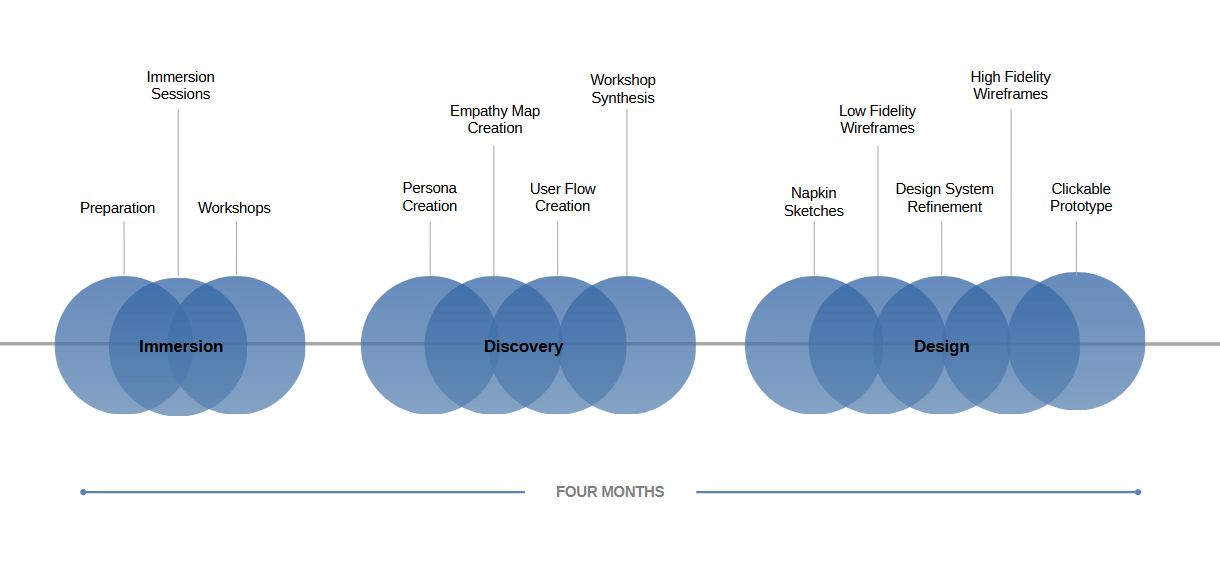
Workshops
We held virtual workshops (through Mural) with key users and stakeholders to gather their insights and collectively align on a common vision for the ideal user experience.
Personas
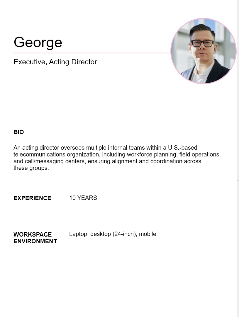
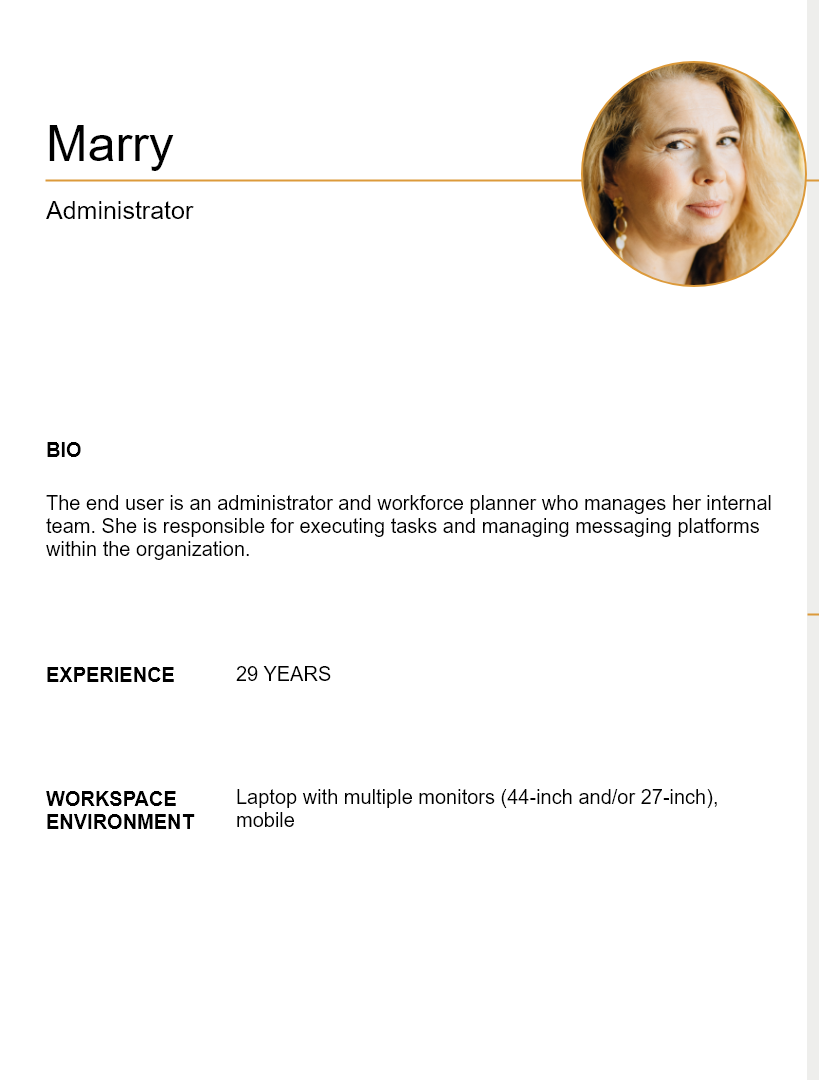
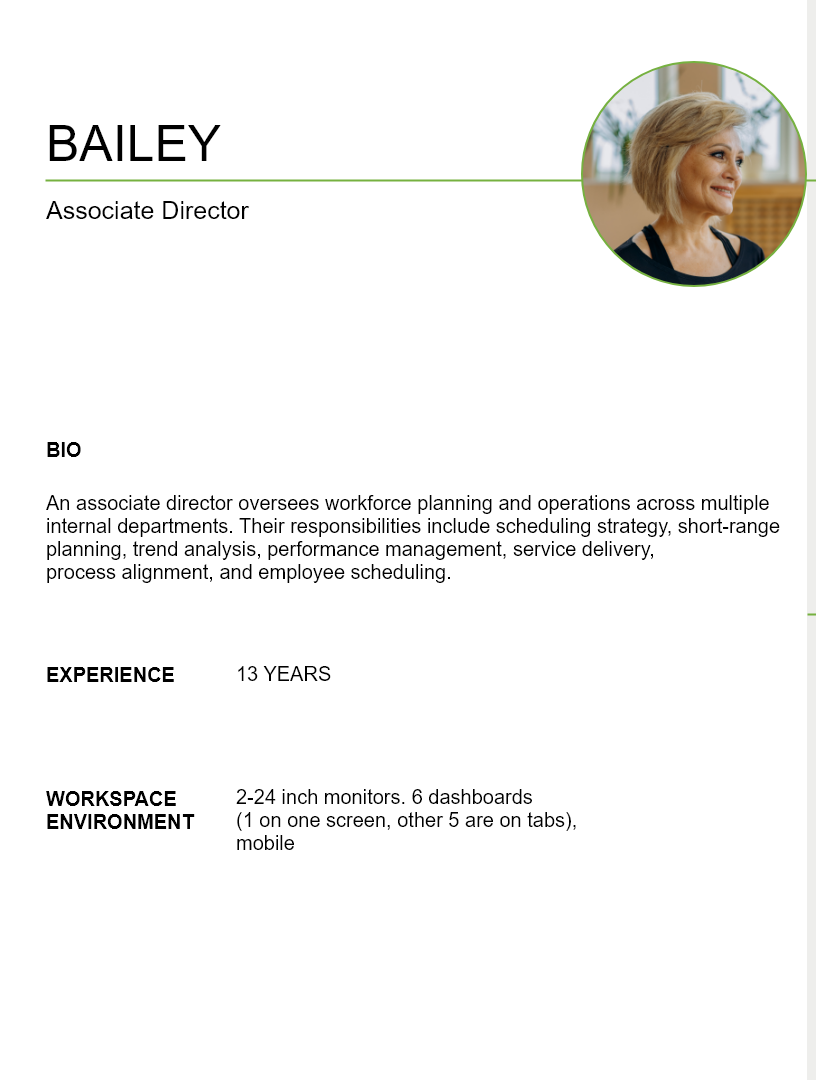
Through persona creation, we identified each user group’s background, key tasks, and pain points, enabling a better understanding of their workflows and needs.
Business Pain Points
The current desktop platform does not effectively surface key metrics for executives.
Data inconsistencies exist across different sources, making it difficult to trust reported numbers.
There is no proactive view to forecast strategies in real-time.
Process Pain Points
Data is not centralized, causing communication breakdowns between executives and operational teams.
Users receive too many alerts, leading to alert fatigue.
Manual processes are required to communicate updates, often forcing executives to reach out individually to understand how teams are addressing issues.
UI Pain Points
The desktop interface is overly dense and requires large screens to digest information effectively.
Retrieving information requires an excessive number of steps.
Alerts cannot be differentiated by priority.
There is no way to view data by team or category, creating barriers to quickly understanding staffing and other key metrics.
Empathy Maps
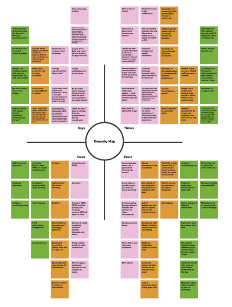
Empathy maps enabled us to get further perspective on what each user group said, thought, did and felt.
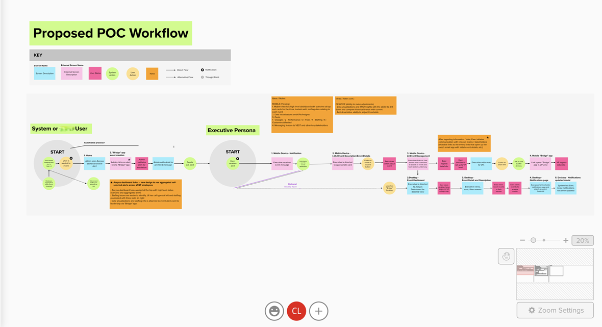
User Flows
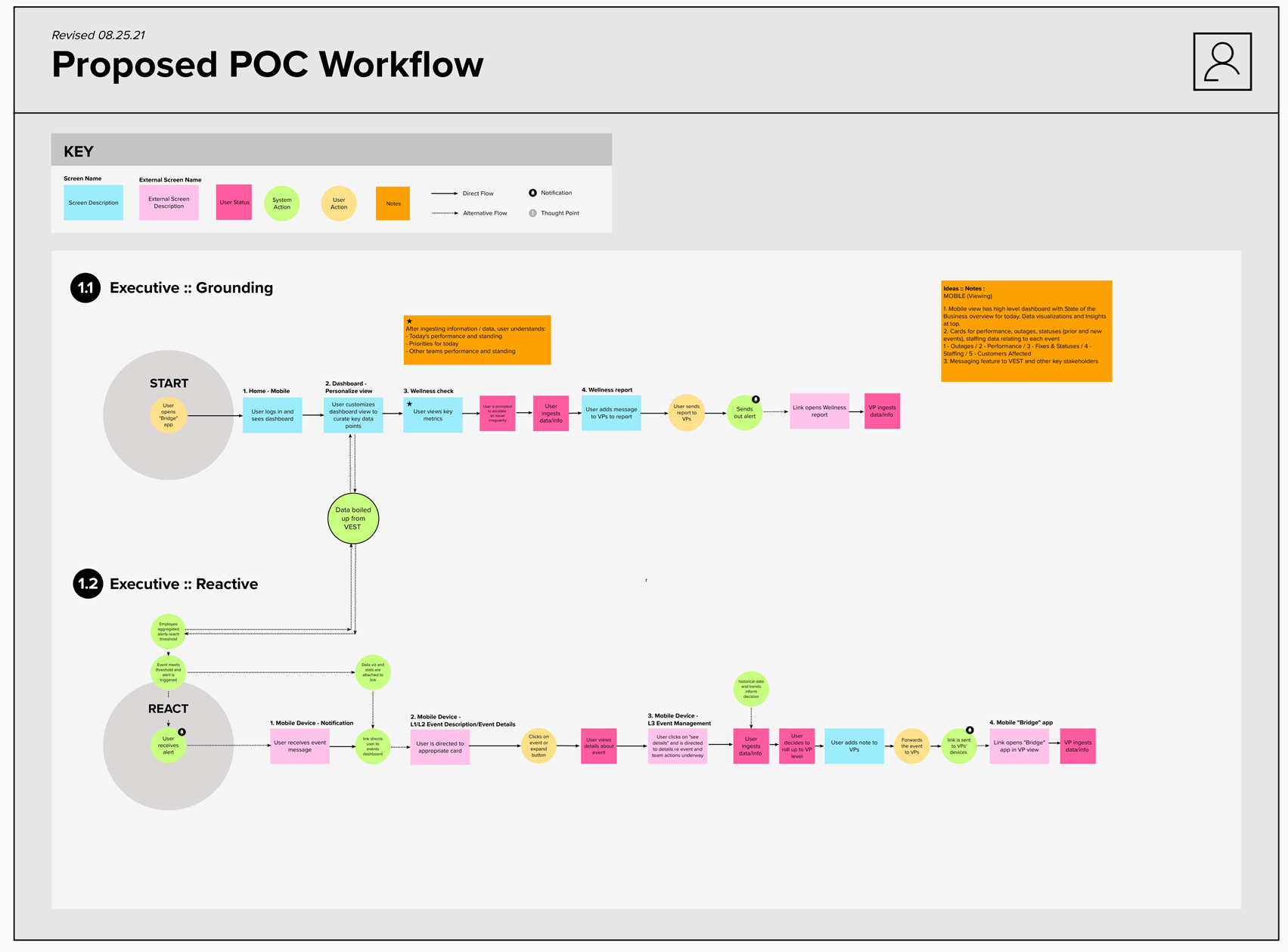
We created two user flows to map out the key tasks and goals that executive users could accomplish in the new mobile application solution.
Napkin Sketches
To help prioritize features and content, we created napkin sketches based on identified opportunity areas. Each feature was described in terms of its purpose, the value it provides to users, and how it would be displayed. We collaborated with internal stakeholders to prioritize features before moving into the foundational design phase.
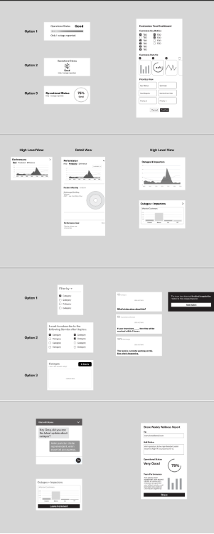
Foundation Design
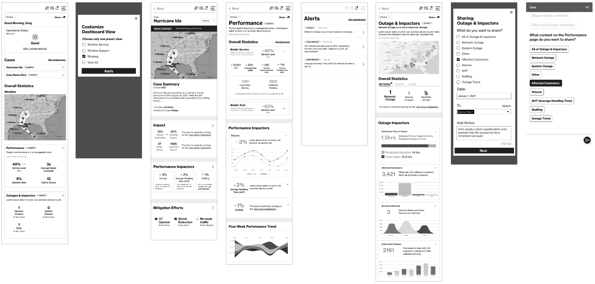
After we nailed down prioritization with Napkin Sketch sessions, we dove into with low fidelity wireframes. Low fidelity wireframes were helpful for us to have a foundation to build detailed designs on.
Detailed Design
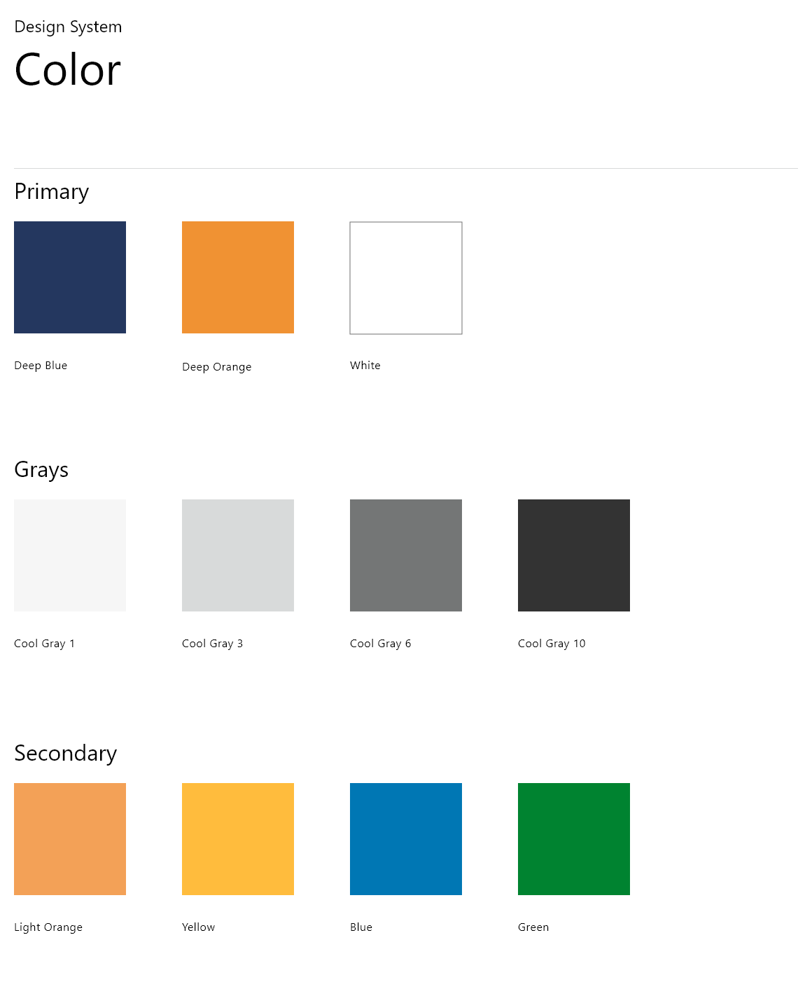
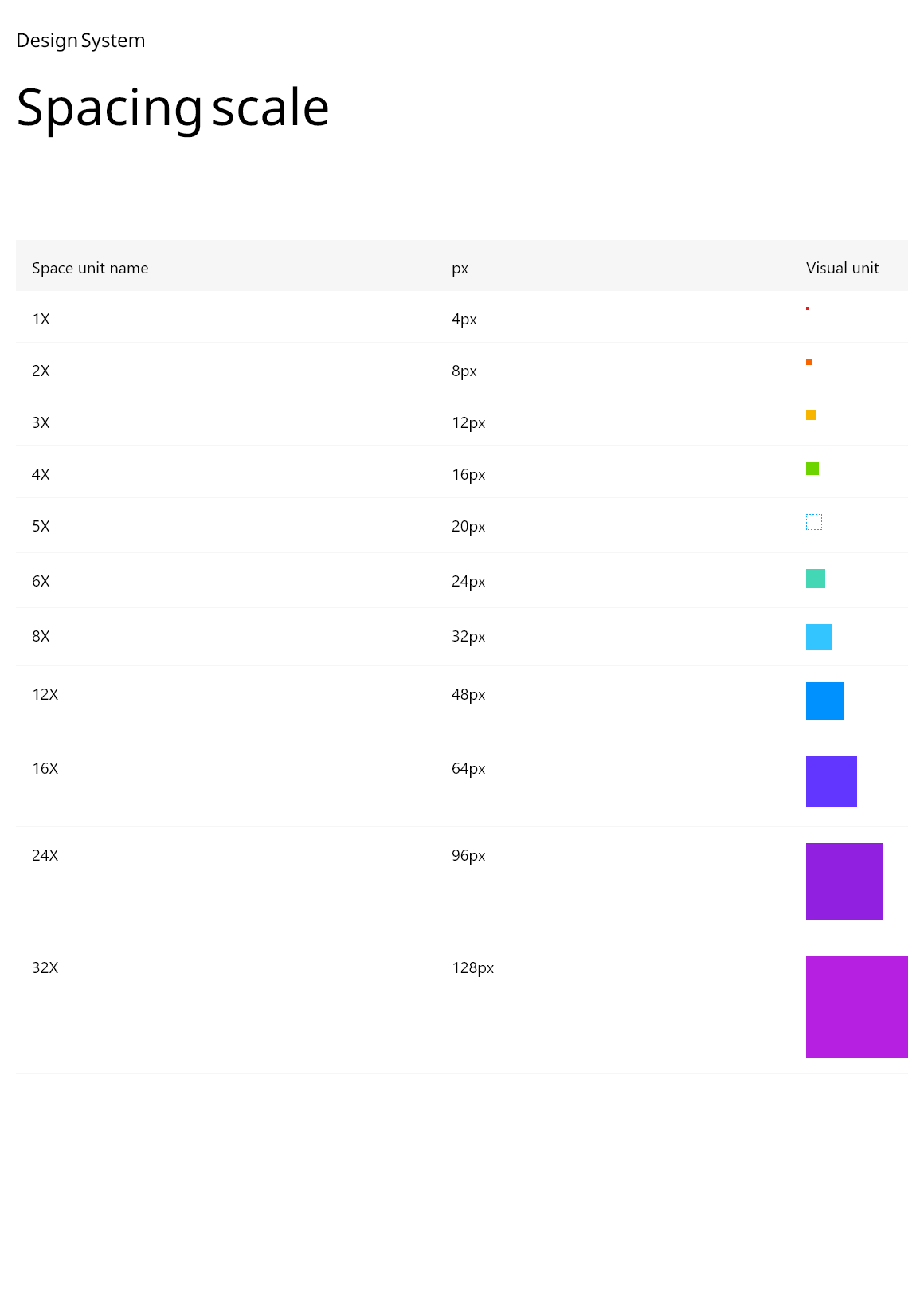
Existing internal design systems, component libraries, and usage guidelines were referenced to inform consistent web and mobile design decisions.
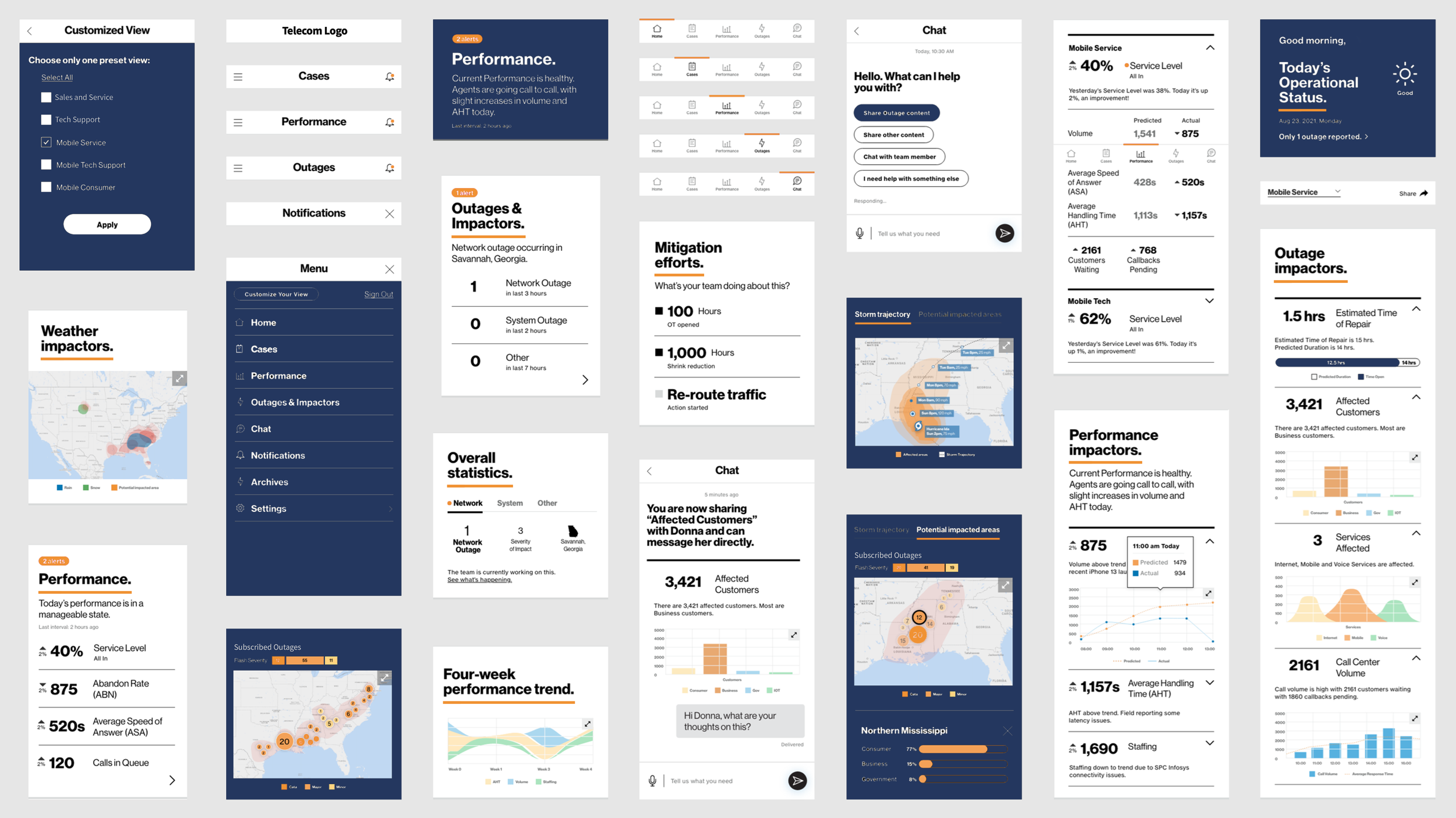
High Fidelity Designs
Results
The outcome of this project was an elevated mobile experience designed to unify fragmented internal data into a clear and actionable format. While the solution was validated through a clickable prototype internally, portfolio artifacts focus on the finalized design approach and key screens due to confidentiality constraints. The redesigned experience enables leadership users to quickly understand business health and respond to time-sensitive events through a streamlined, mobile-first interface.
Before
Leadership users relied on fragmented desktop tools to monitor business performance. Critical information was spread across multiple systems, requiring excessive effort to piece together insights and slowing response times to time-sensitive events.
After
The redesigned mobile experience consolidates key operational data into a single, executive-focused interface. Information is surfaced in digestible, prioritized views, allowing leadership users to quickly assess business health and respond with confidence—regardless of location.