HX Design System
Evolving an internal design system from foundational components (XD) to a scalable, container-based library in Figma
Note: Names, branding, and certain details have been adapted for confidentiality. This case study focuses on system structure, evolution, and design decision-making.
Overview
An internal design system created to support a healthcare-focused, data-heavy enterprise web platform. The system was developed in two phases—first established in Adobe XD (2019), then migrated and expanded in Figma (2024) to improve scalability, consistency, and maintainability.
Role
Phase 1 (2019): UI Designer — Design System Foundations
Phase 2 (2024): UI Designer — Design System Migration & Expansion
Team
Phase 1: Solo UI Designer
Phase 2: Product Design Lead (direction & review), Engineering partners (implementation alignment)
Timeline
2019: Initial design system built in Adobe XD
2024: System rebuild, consolidation, and expansion in Figma
Tools
Adobe XD, Figma
Context
This project began as an internal initiative to establish consistent UI foundations for a growing enterprise healthcare platform. Over time, as more workflows were introduced, UI implementations became increasingly inconsistent and harder to maintain. The system required modernization and clearer structure—leading to a migration and rebuild in Figma focused on scalability and long-term usability.
Goals
Establish reusable UI foundations across multiple workflows
Reduce visual and structural inconsistency
Improve scalability and long-term maintainability
Create a clearer system structure that supports modular front-end development patterns
Constraints
Legacy assets from an early XD-based system
Interim updates by multiple contributors over time
Limited scope to redesign visuals from scratch
Internal and confidential nature of the project
Design Principles & Approach
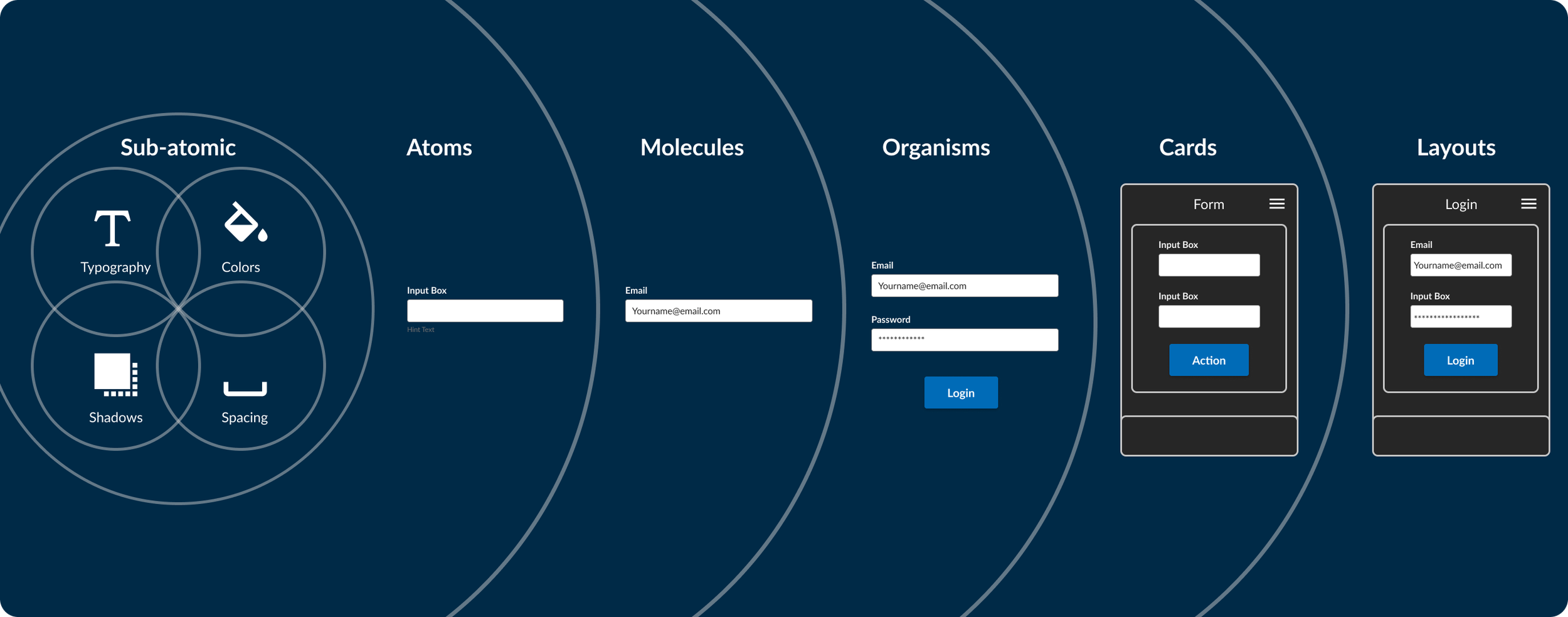
From Atomic to Container-Based Thinking
The initial system was informed by atomic design principles to establish foundational building blocks. As the platform evolved, the system shifted toward a container-based approach better suited for enterprise applications.
Higher-level UI components—such as cards, side panels, and accordions—were treated as structural containers that group related information, states, and actions. This approach supports clarity, composability, and reuse in data-heavy workflows.
Alignment with Micro-Frontend Concepts
The system was designed with modular front-end development in mind, emphasizing decoupled components that can be reused independently and maintained over time as the platform evolves.
Phase 1 — Foundations (Adobe XD, 2019)
In the first phase, I created the initial design system in Adobe XD to establish shared UI foundations. This work focused on defining baseline standards for color, typography, layout, and a core set of reusable components that internal teams could reference as the platform grew.
Key Outputs
Foundational color usage and early semantic guidance
Typography hierarchy and baseline layout rules
Initial component patterns used across early internal screens
While effective as a starting point, this version had limitations in scalability, documentation depth, and collaboration workflows.
Early reusable components used to establish baseline consistency.
Phase 2 — Migration & Expansion (Figma, 2024)
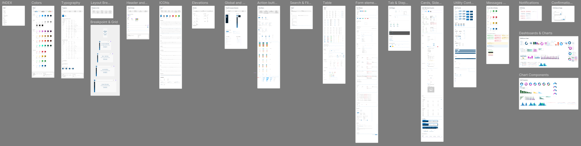
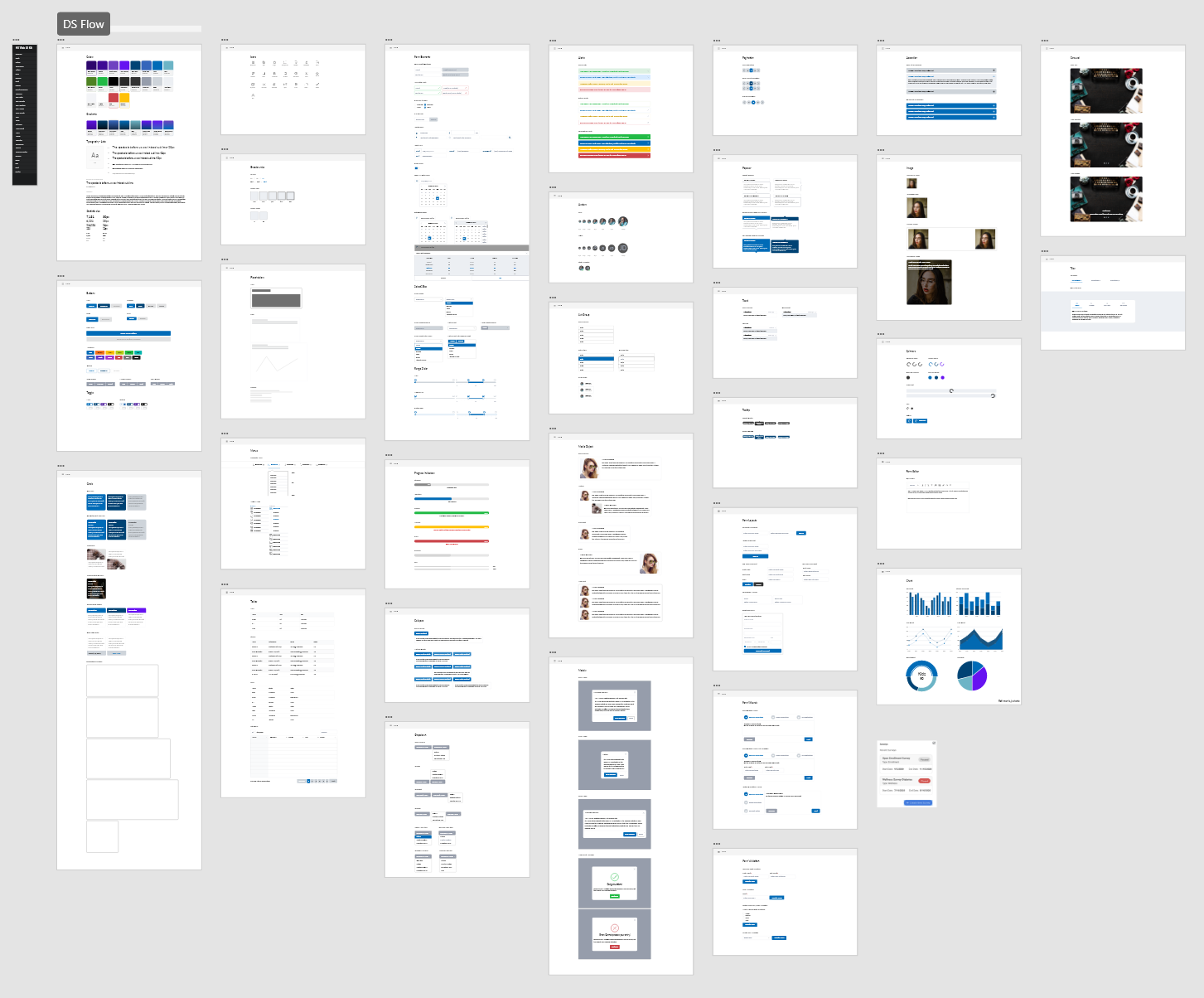
In the second phase, I migrated the design system to Figma and expanded it to improve scalability, organization, and maintainability. The focus was on rebuilding and standardizing components, improving system structure, and making the library easier to adopt and evolve over time.
Key Outputs
Rebuilt and standardized component library in Figma
Expanded container-based components for data-heavy workflows
Documented navigation, action, form, and feedback patterns
Improved system organization for easier reuse and adoption
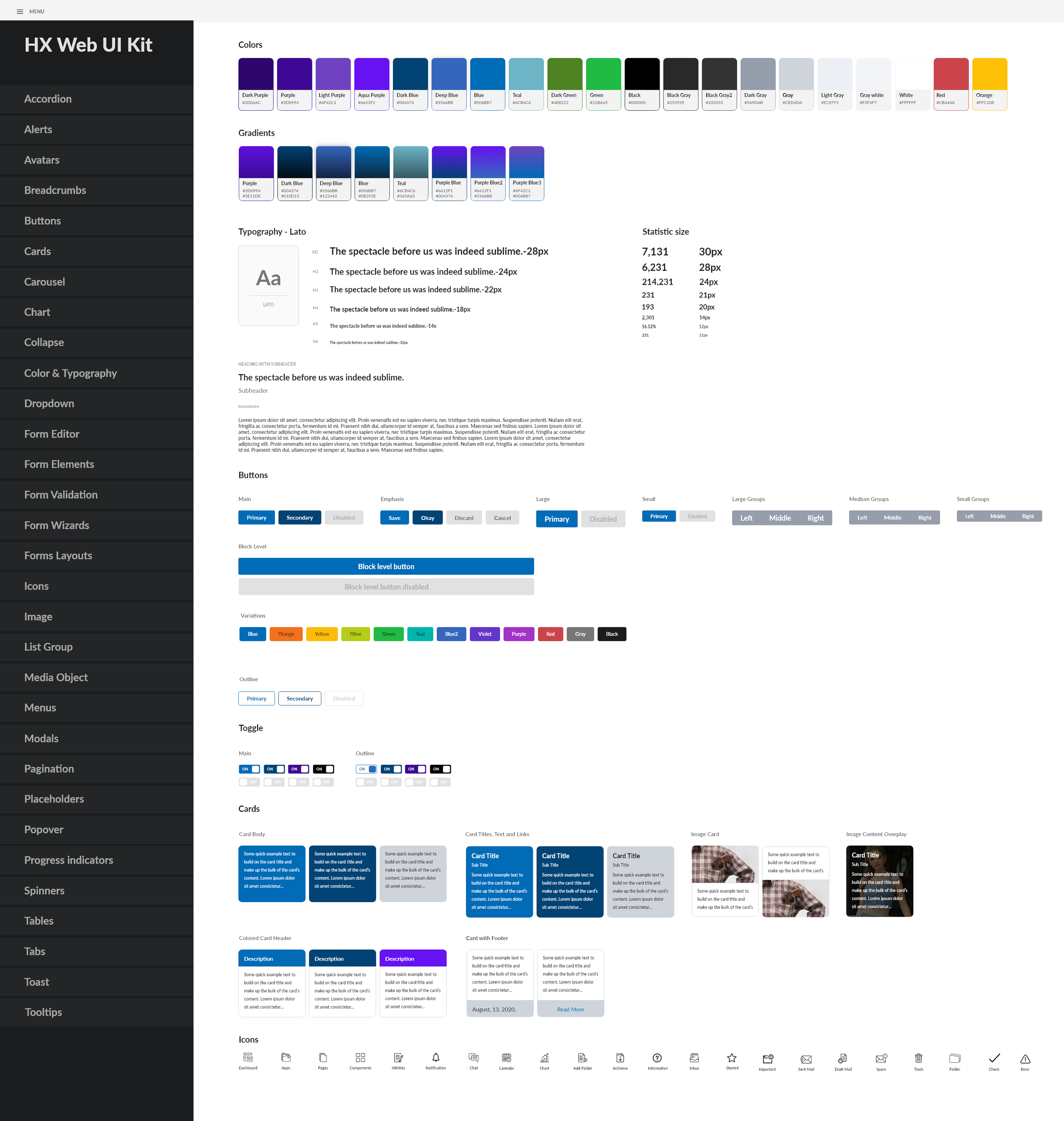
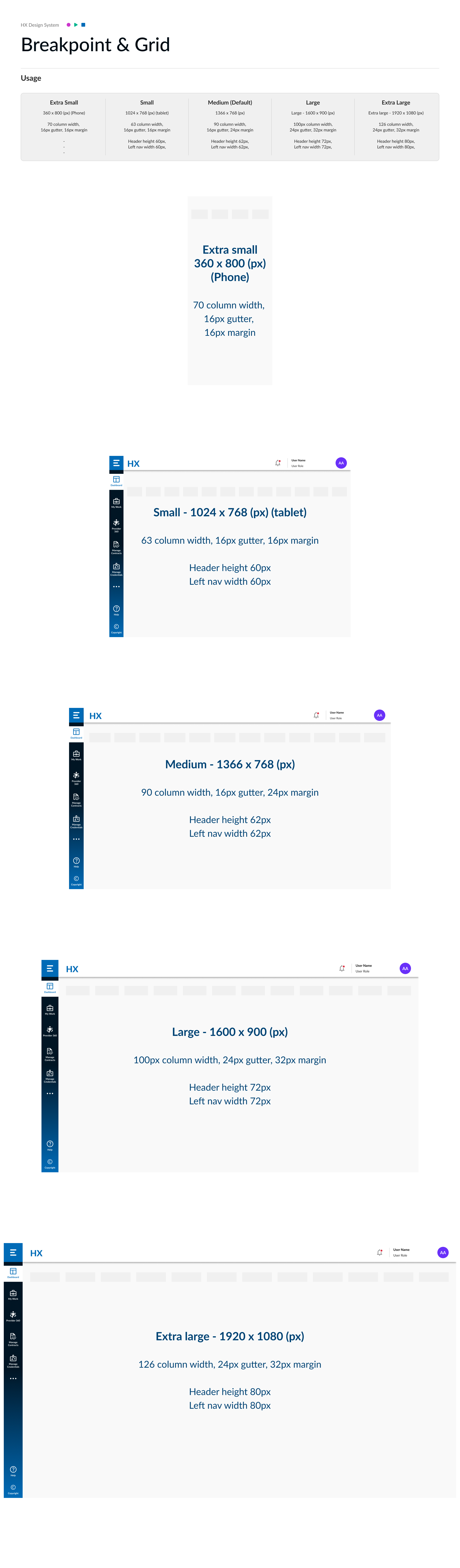
Foundations-Overview
Foundational design elements—color, typography, and layout—established as the base of the system.
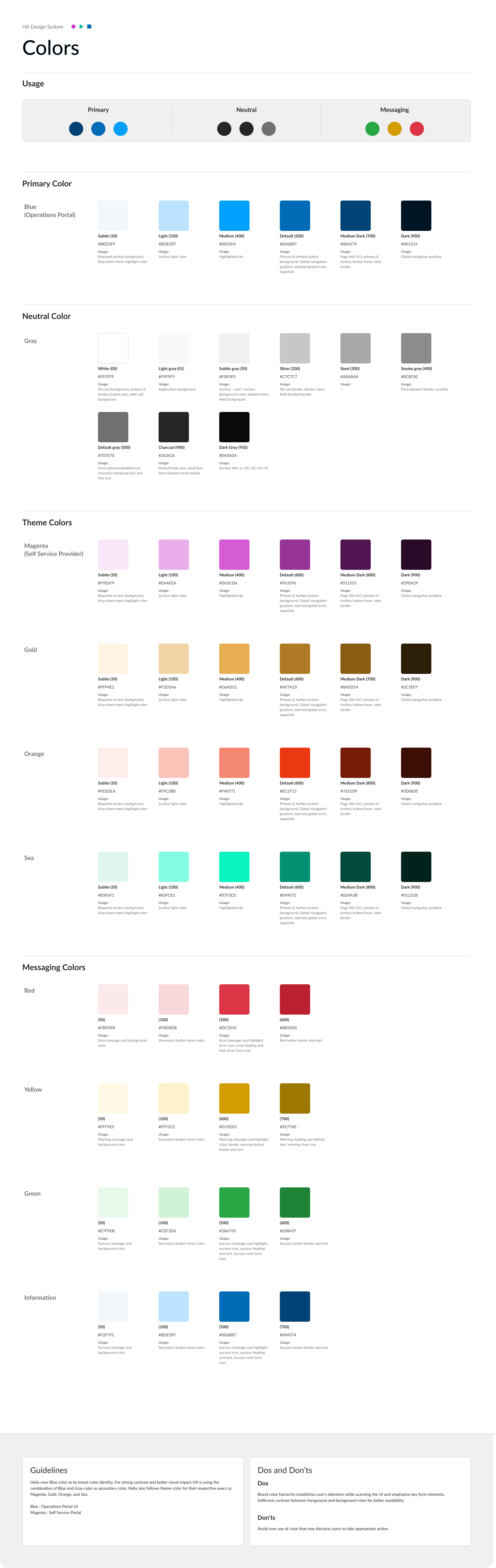
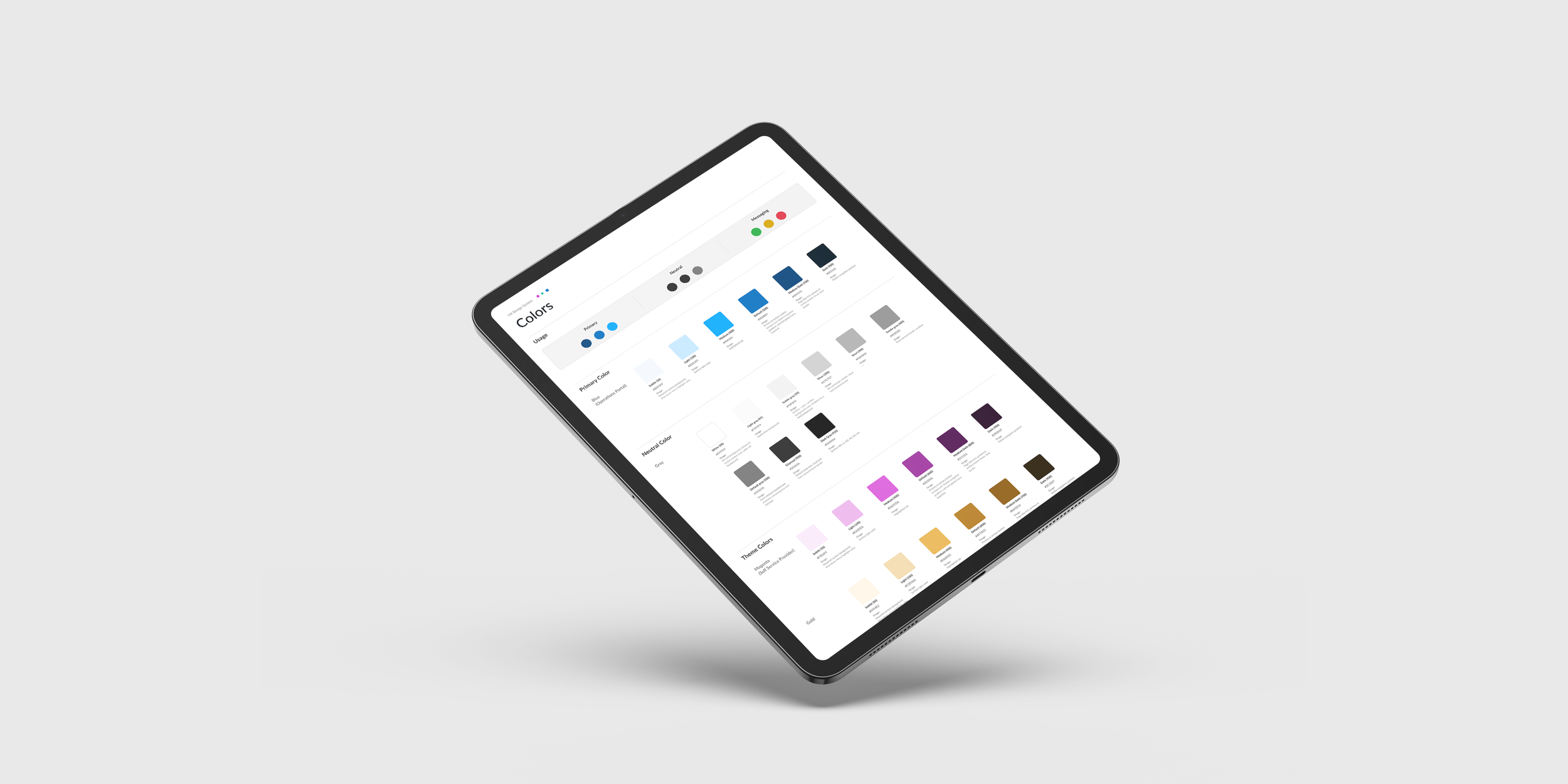
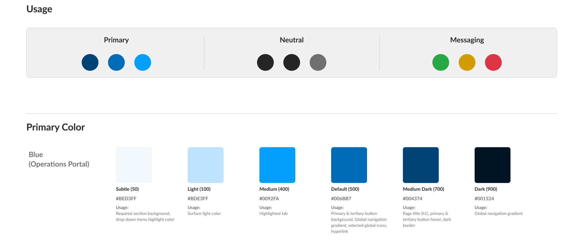
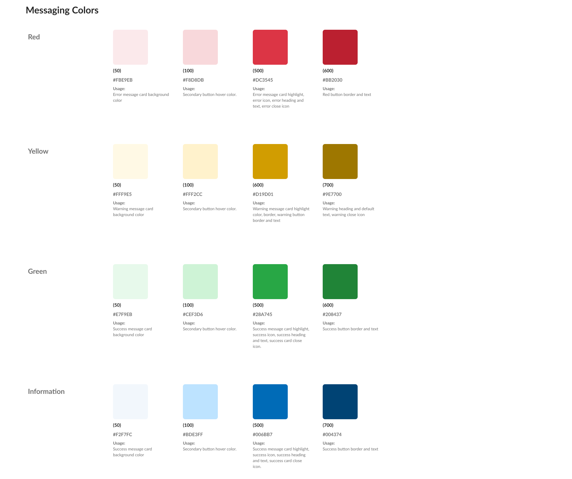
Colors
Color roles defined with semantic meaning to support status, messaging, and data visualization across the platform including primary semantic roles for alerts and status communication.
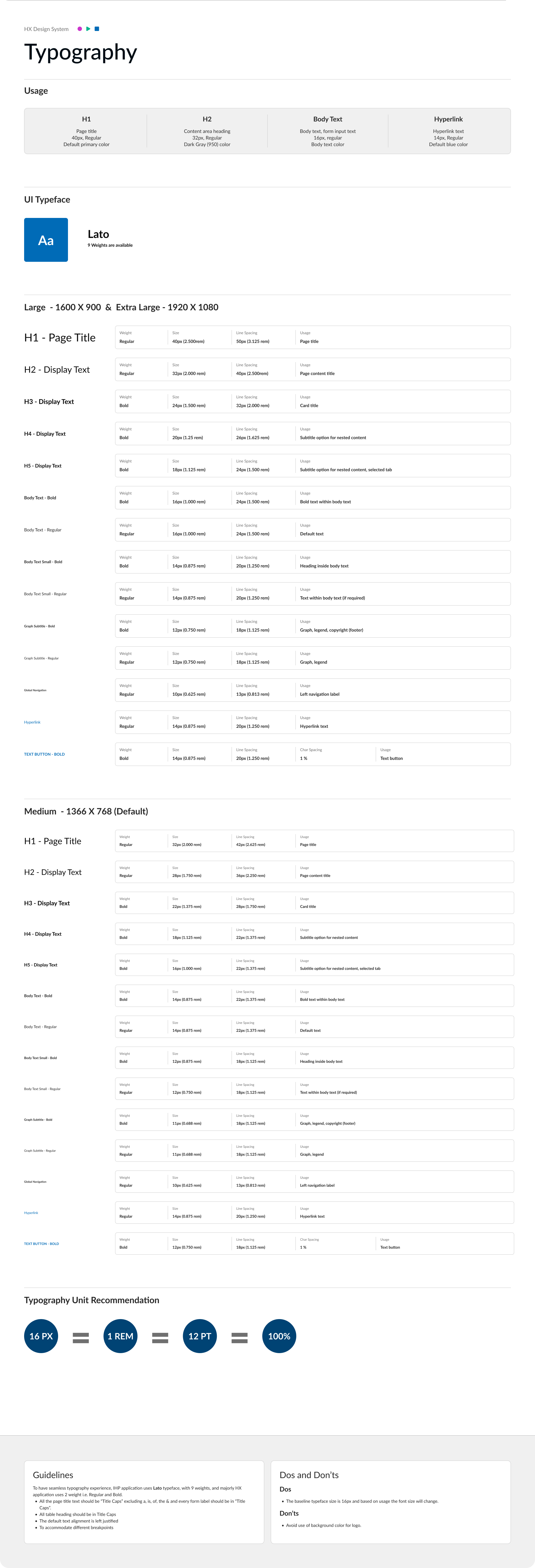
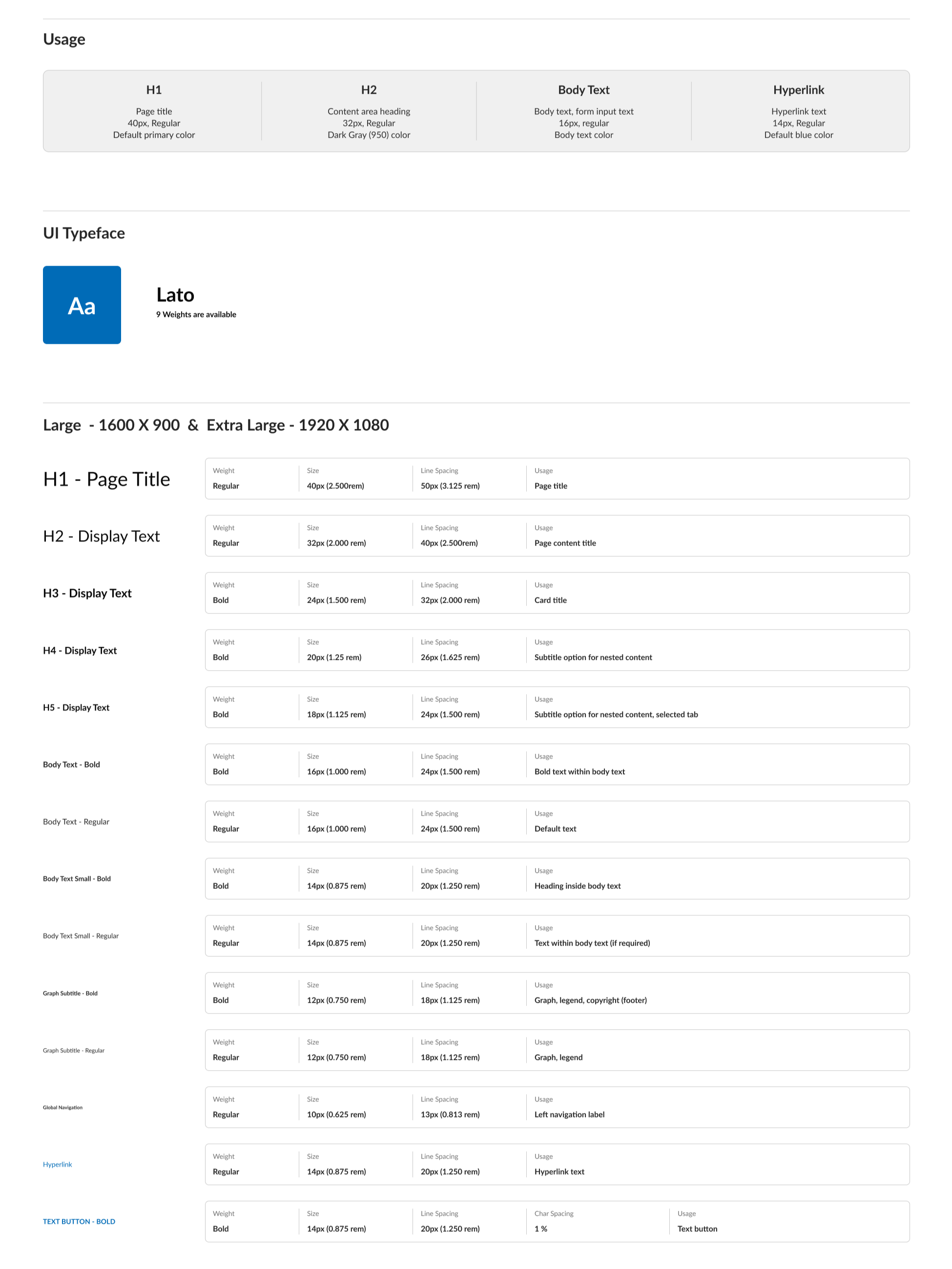
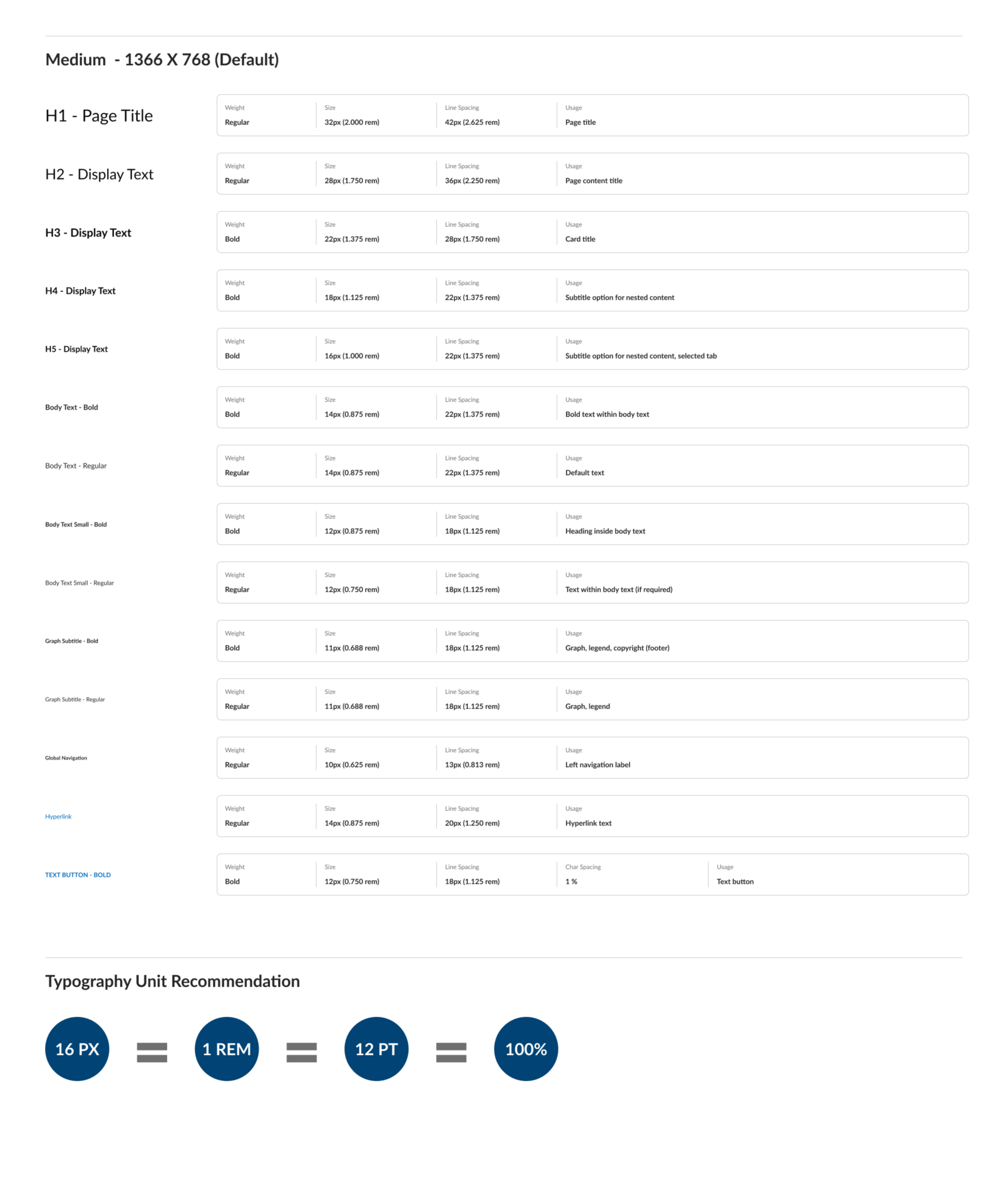
Typography
A structured typography system designed for dense enterprise content, with clear hierarchy and usage guidance.
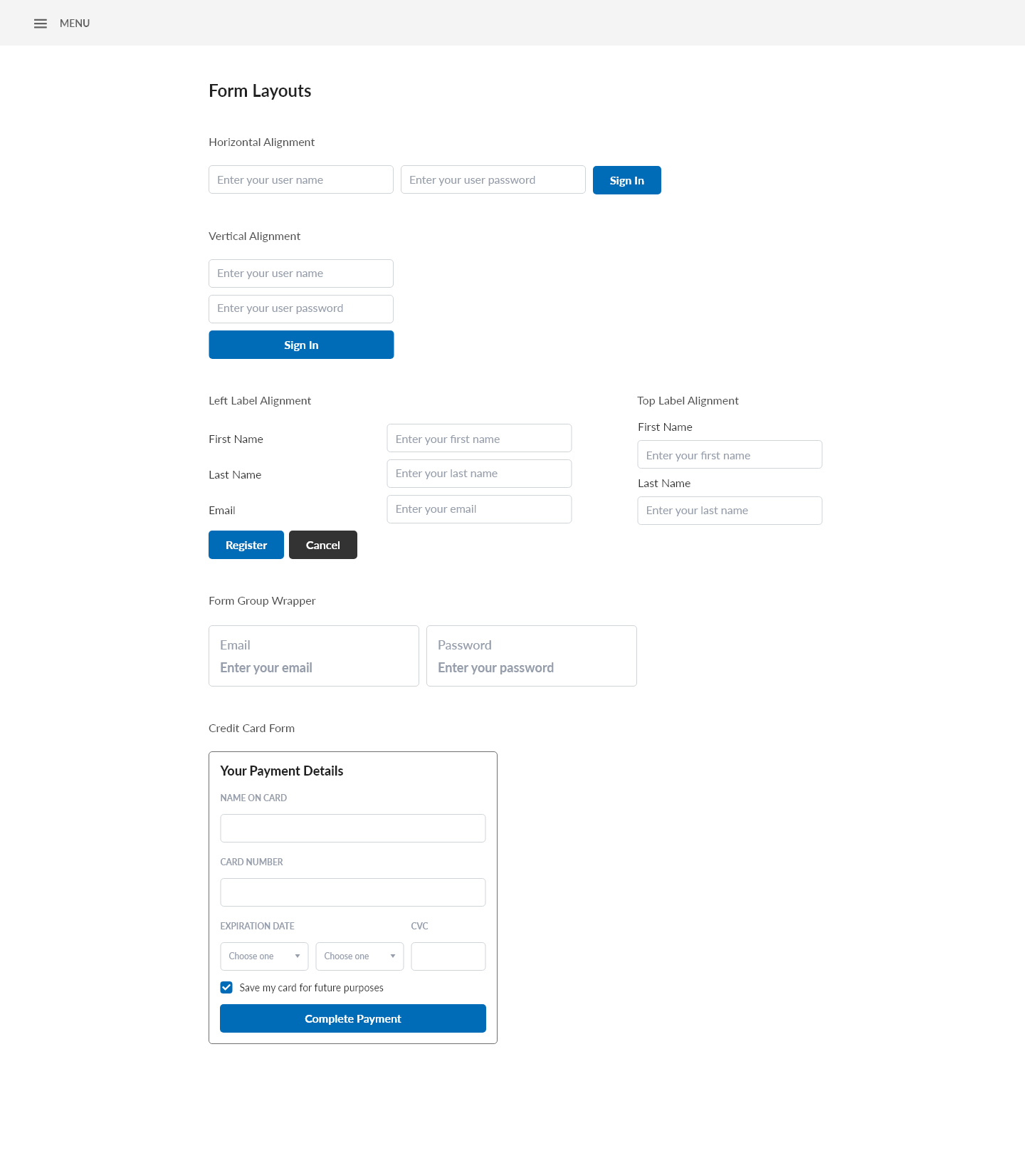
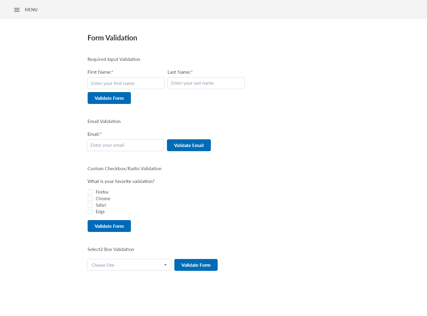
Forms & Data-heavy interactions
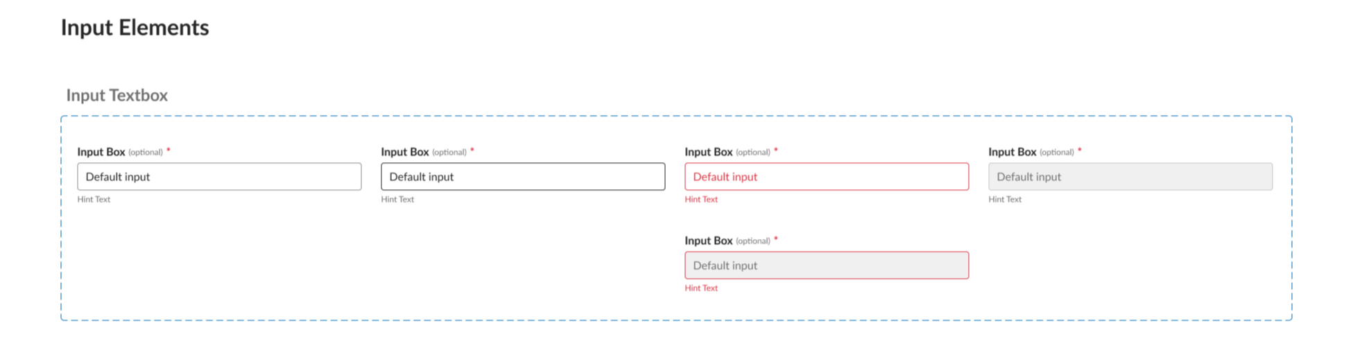
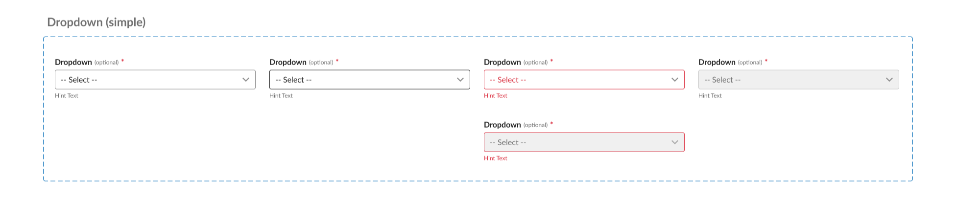
Forms were designed with clear validation, error handling, and action hierarchy to support complex workflows.
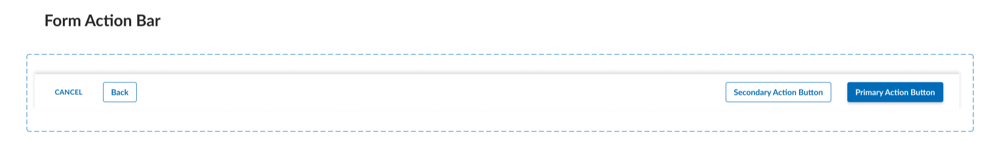
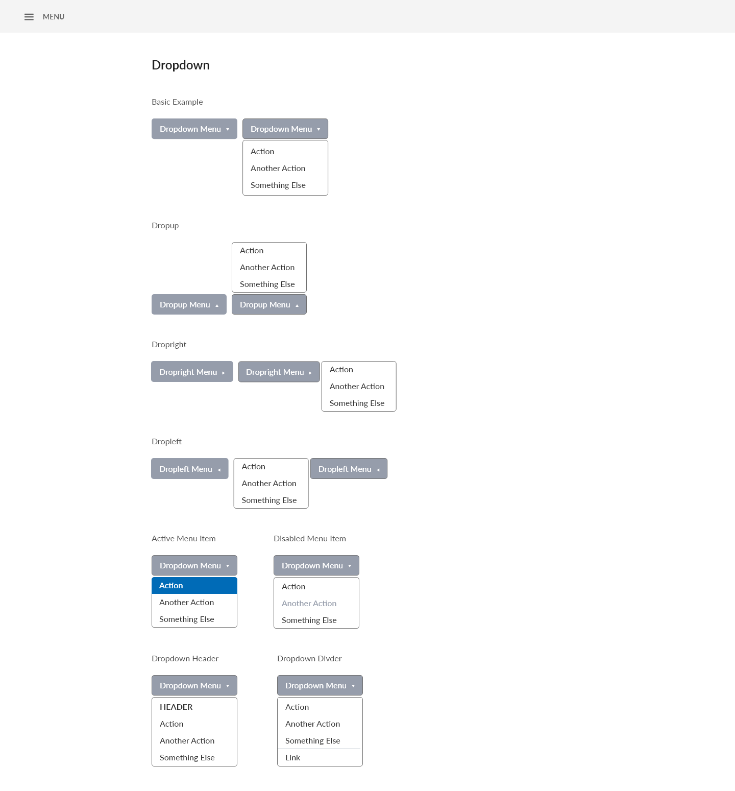
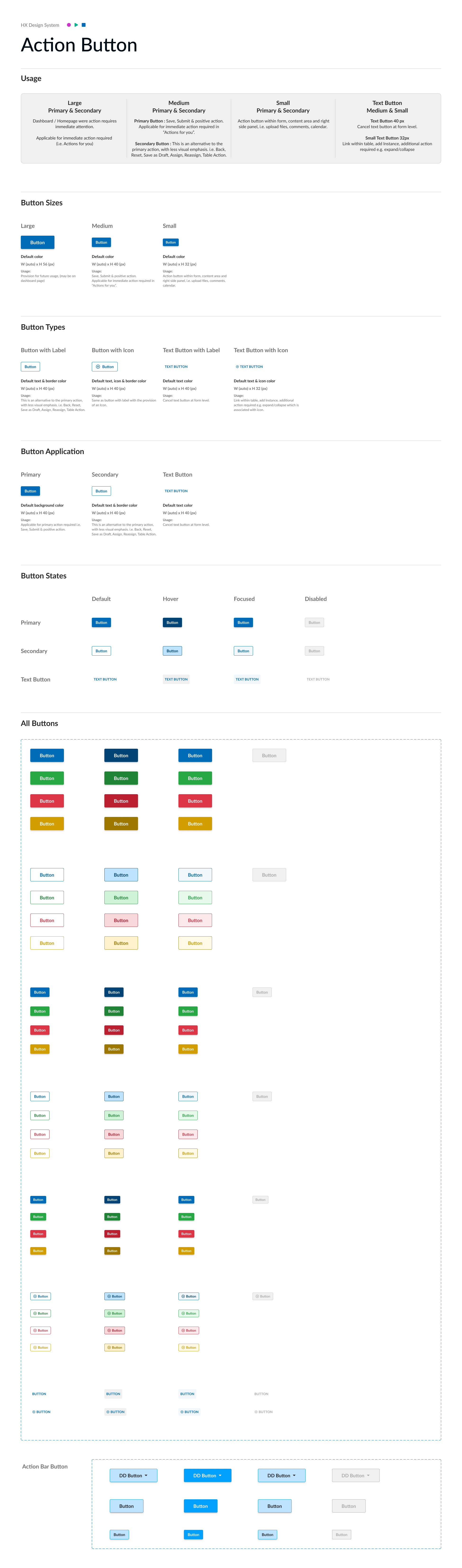
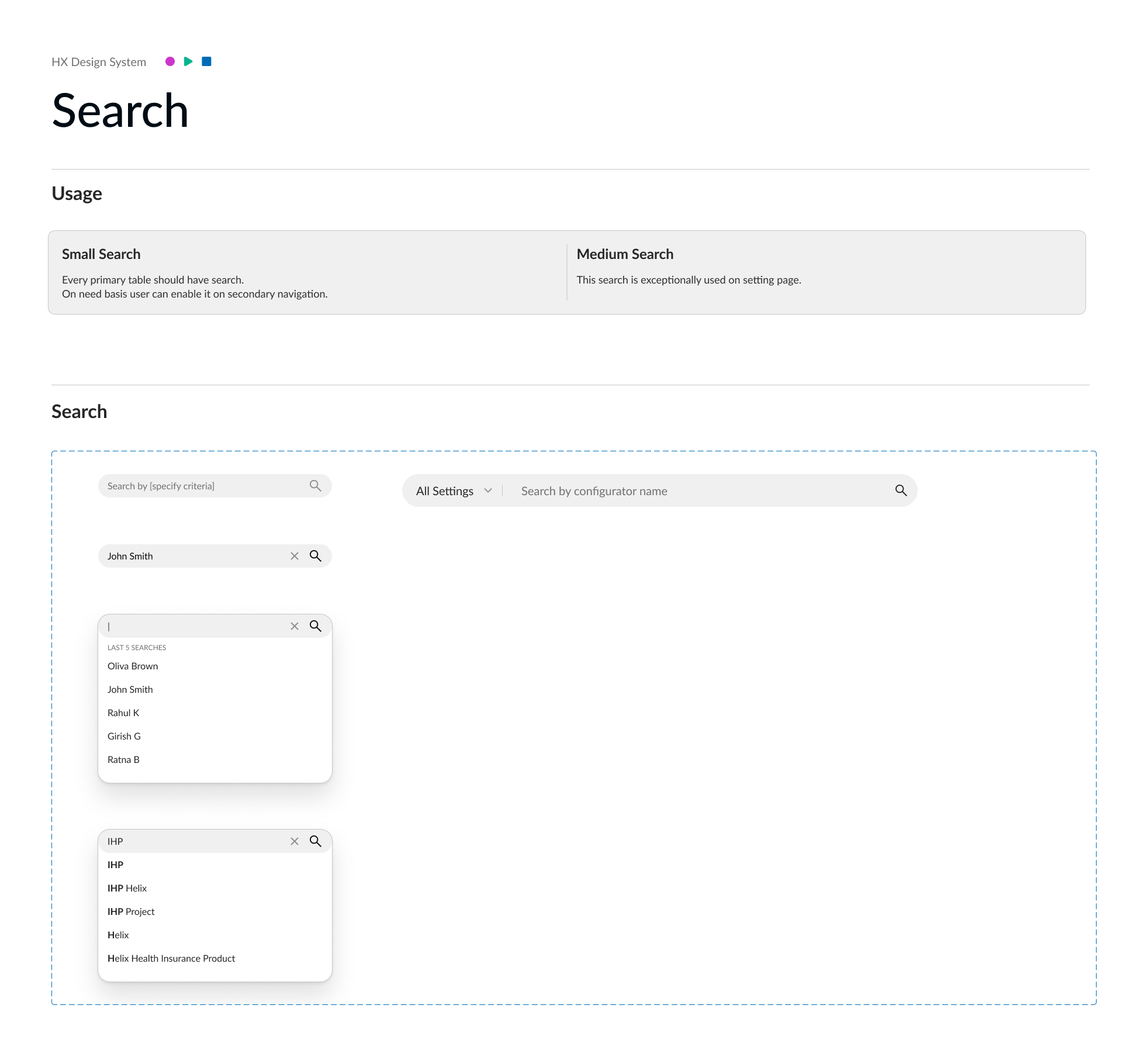
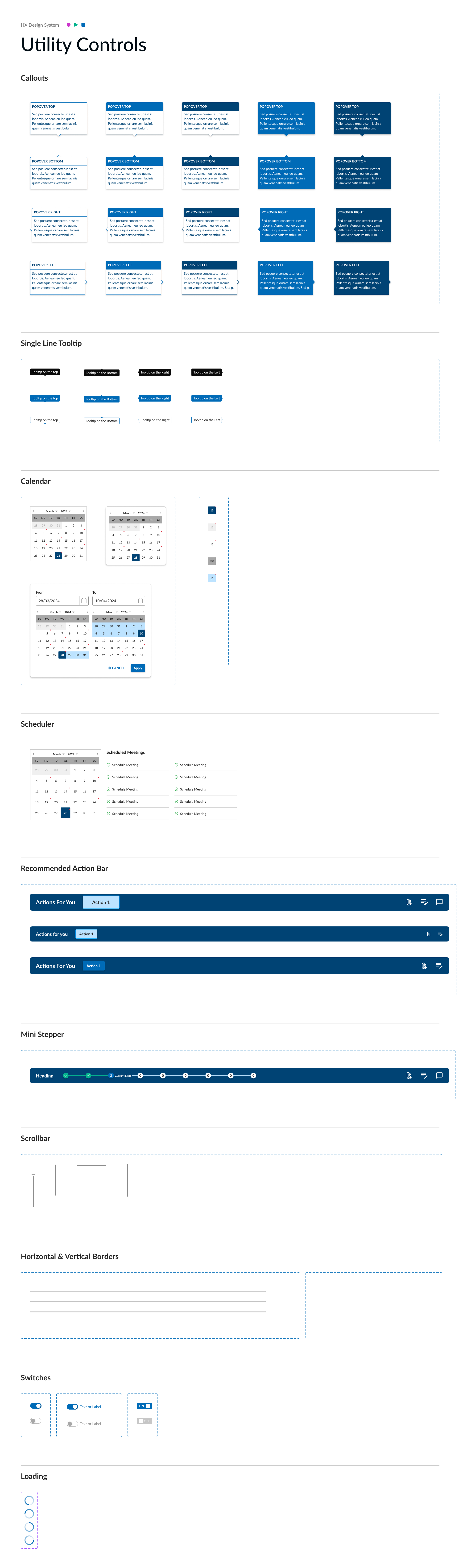
Action & Utility Patterns
Supporting UI controls designed to work consistently within form-driven workflows.
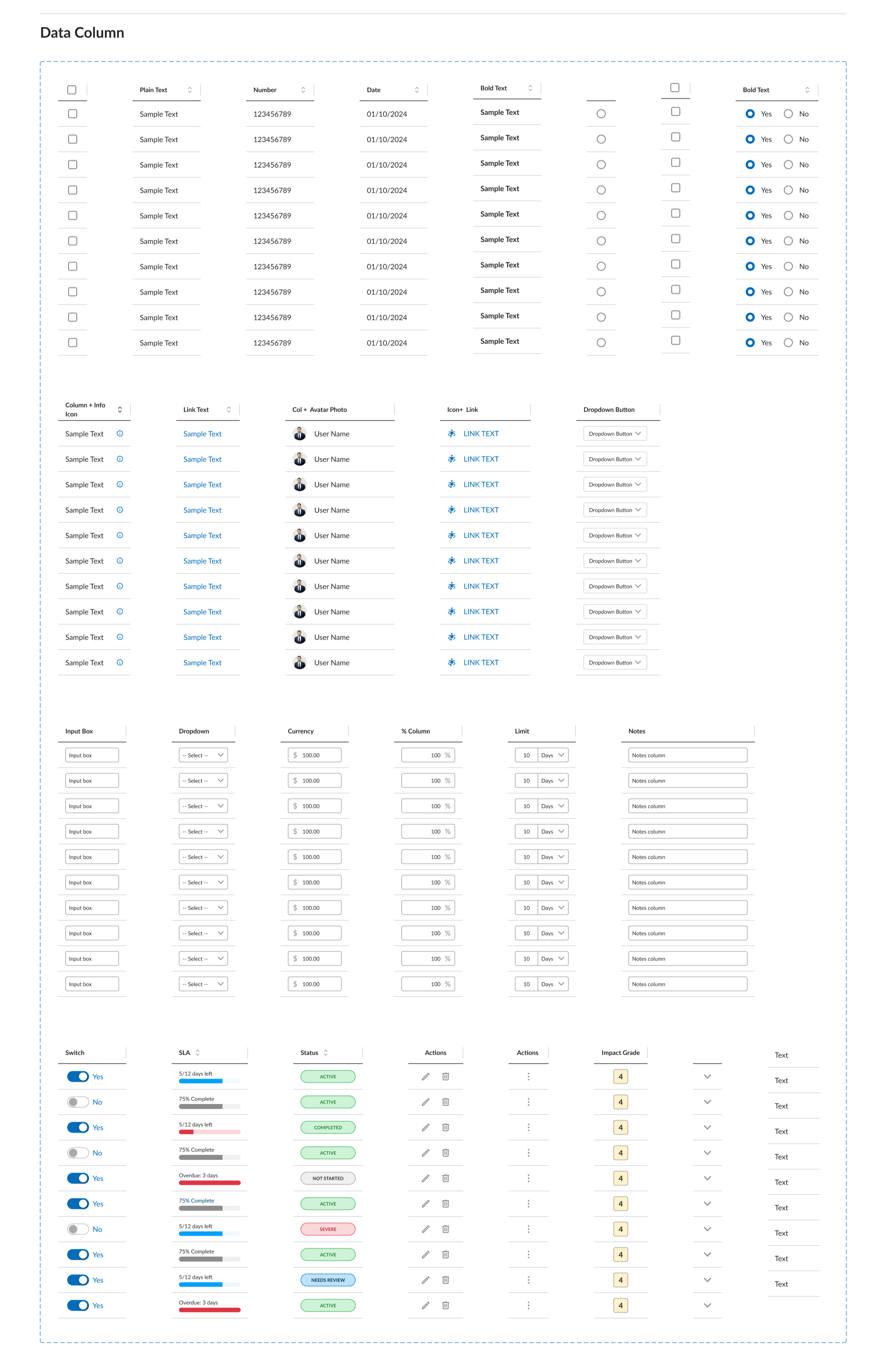
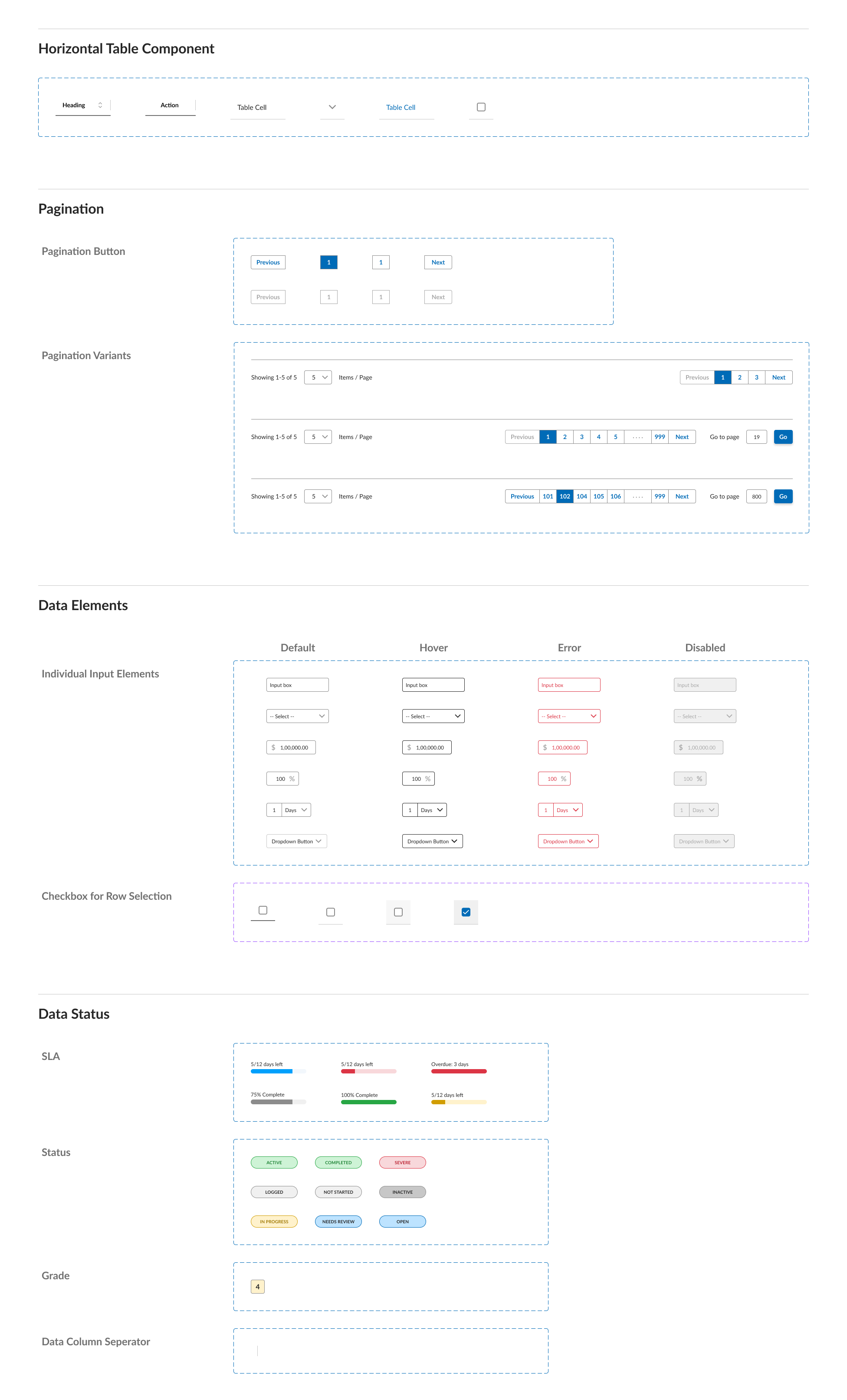
Tables
Reusable table patterns built for data-heavy workflows, supporting multiple configurations and system states.
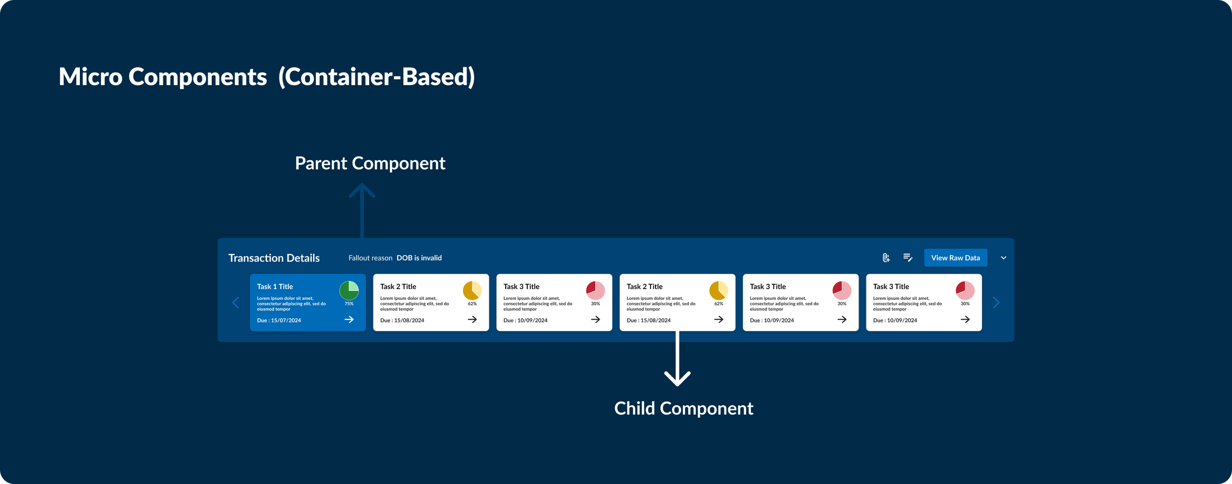
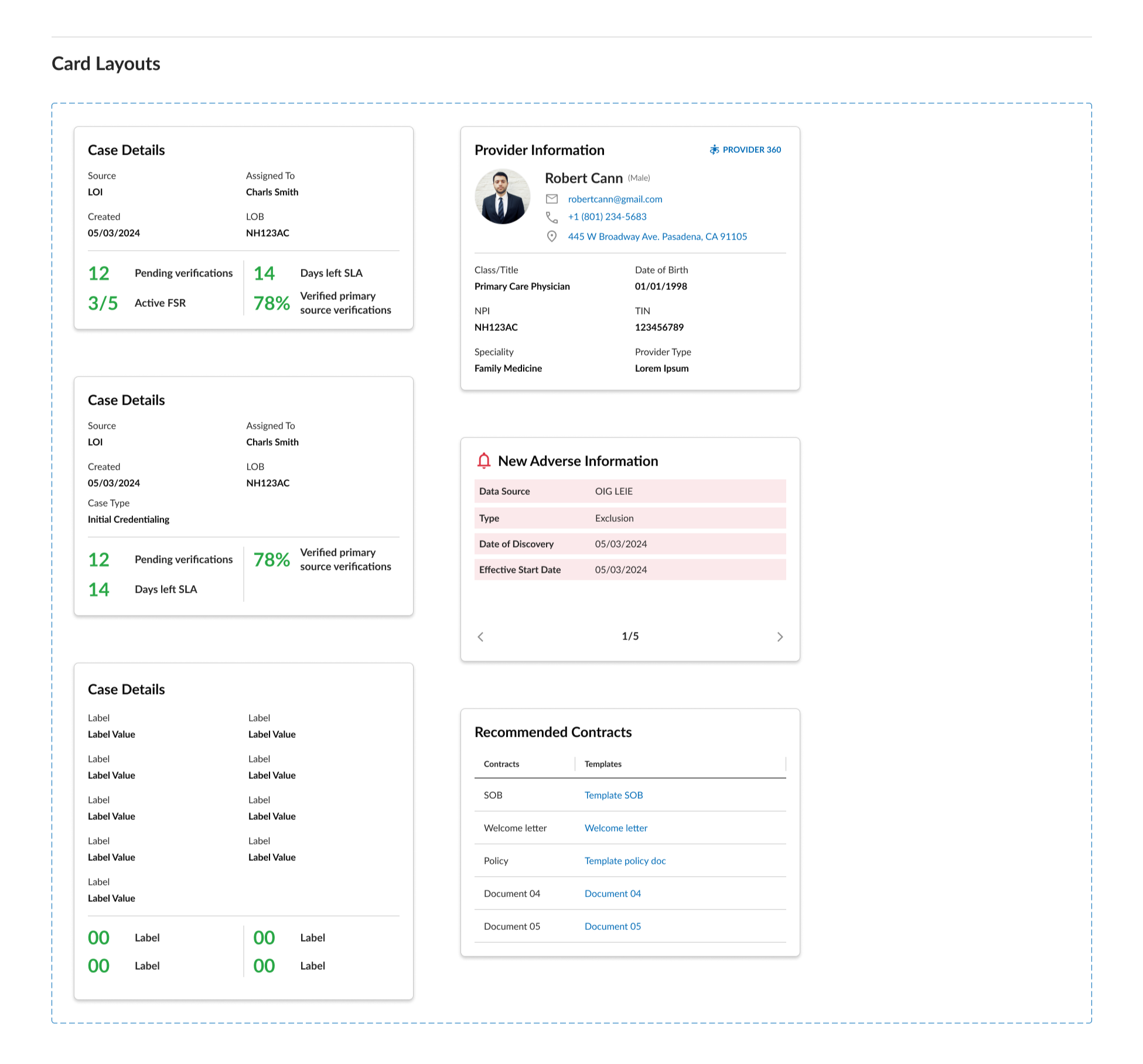
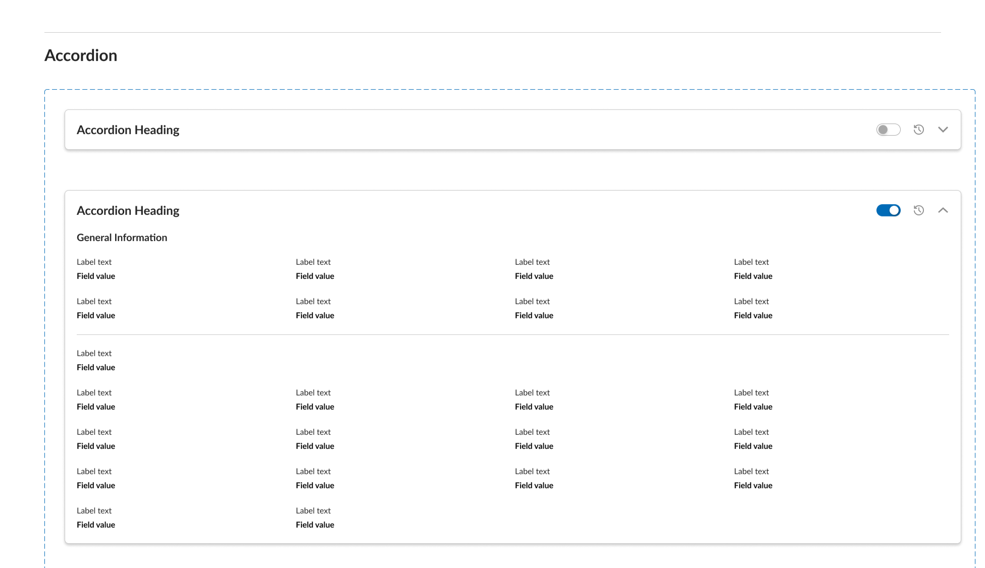
Container Components
I focused on reusable structural components that support complex enterprise layouts and content grouping.
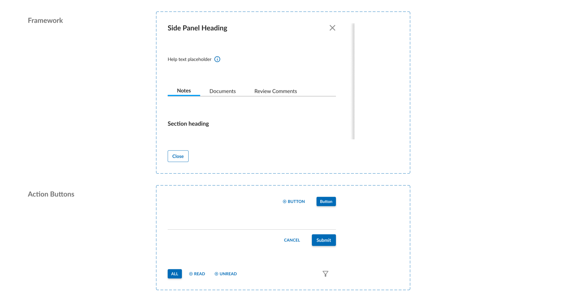
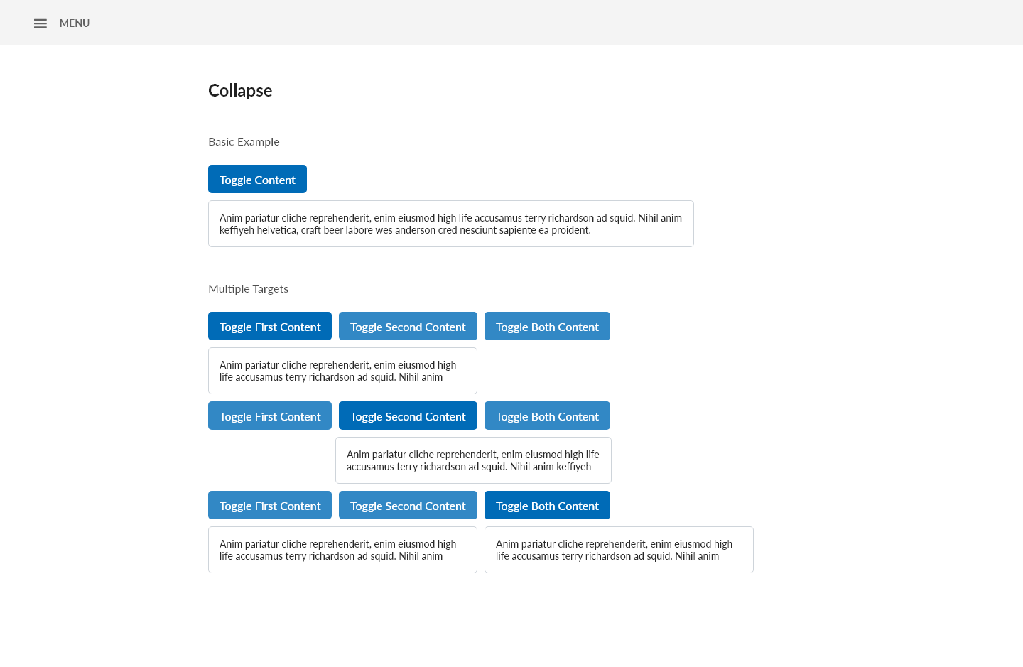
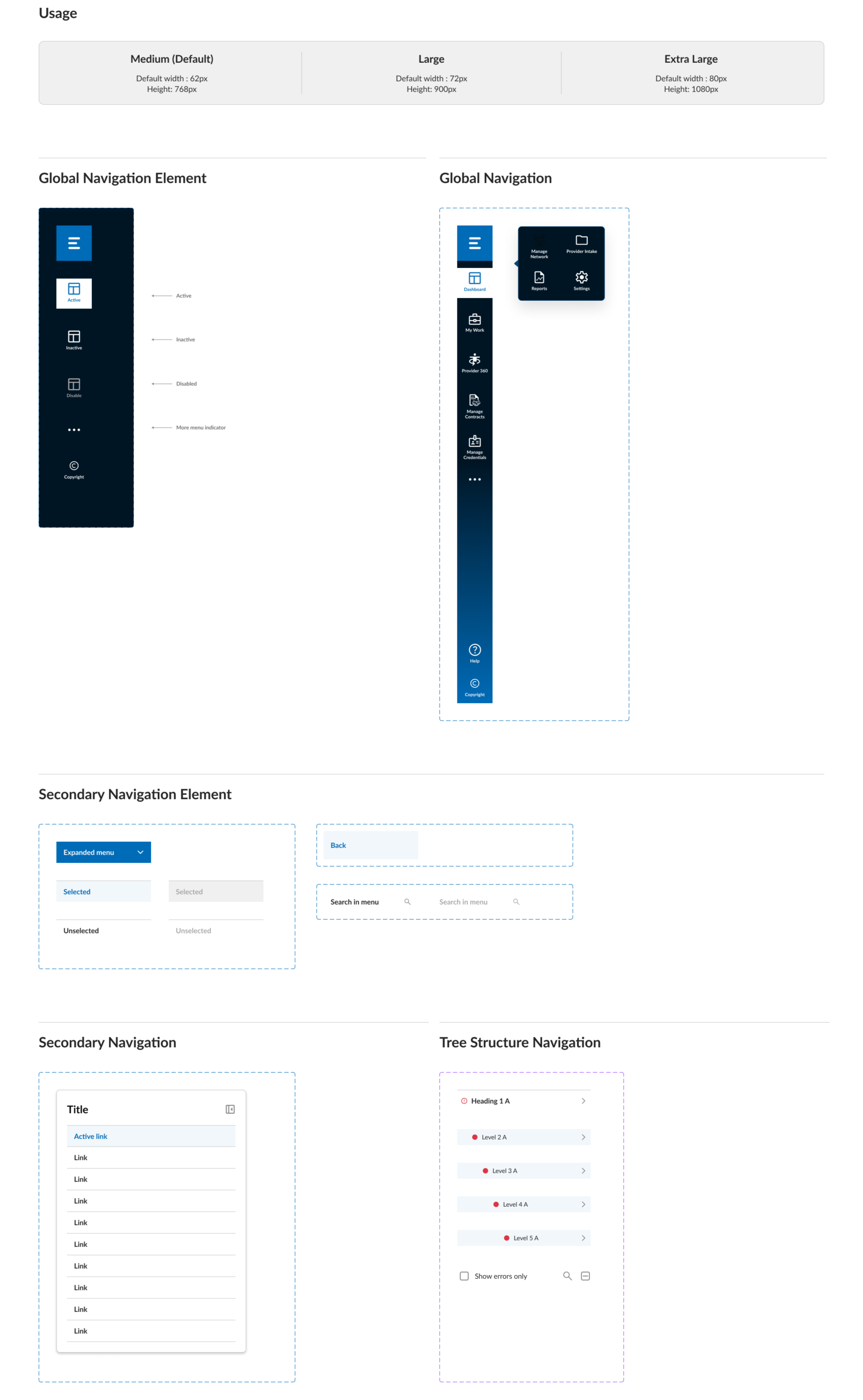
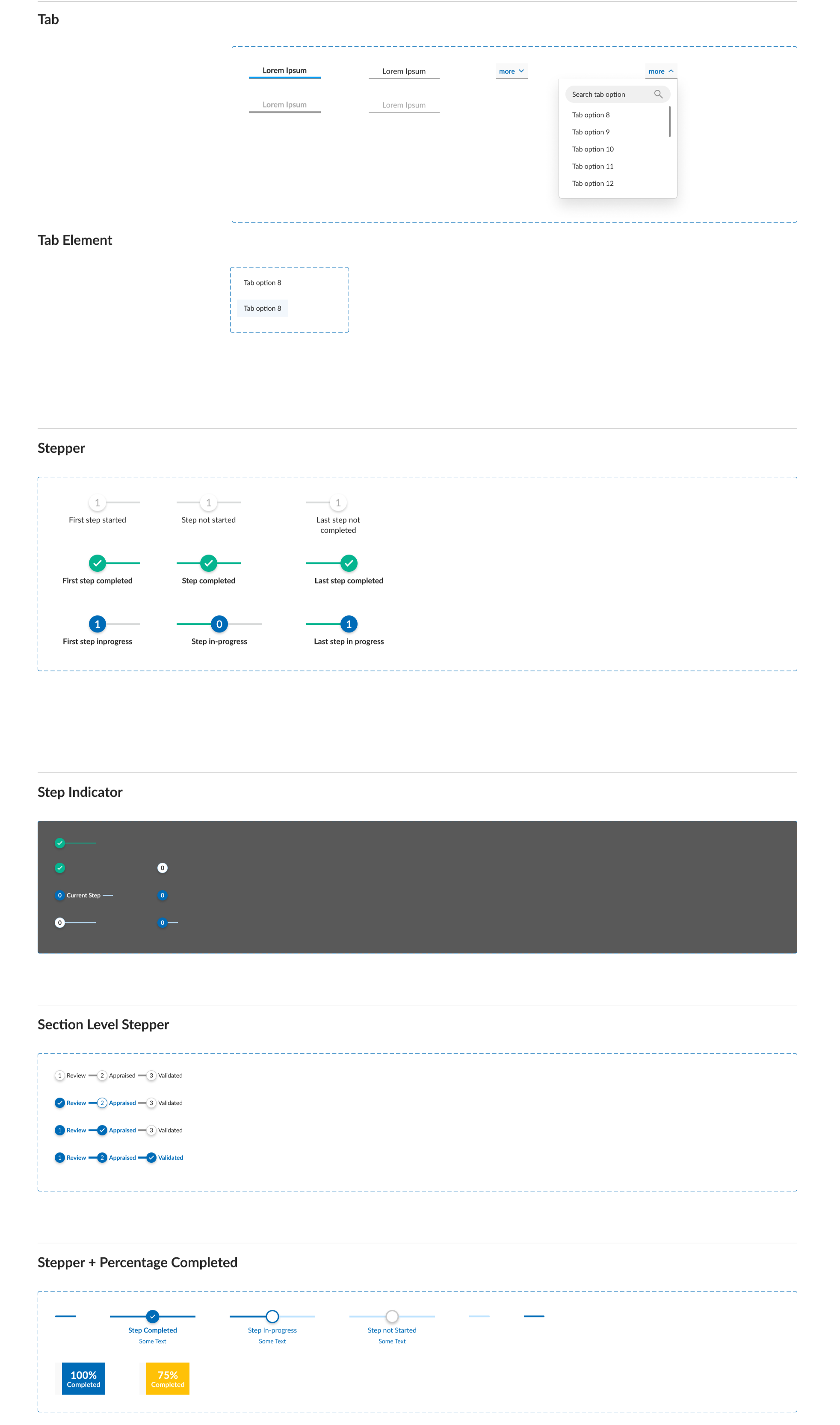
Navigation & Flow Patterns
Navigation and flow patterns were documented to keep information structure consistent and reduce cognitive load across complex internal workflows.
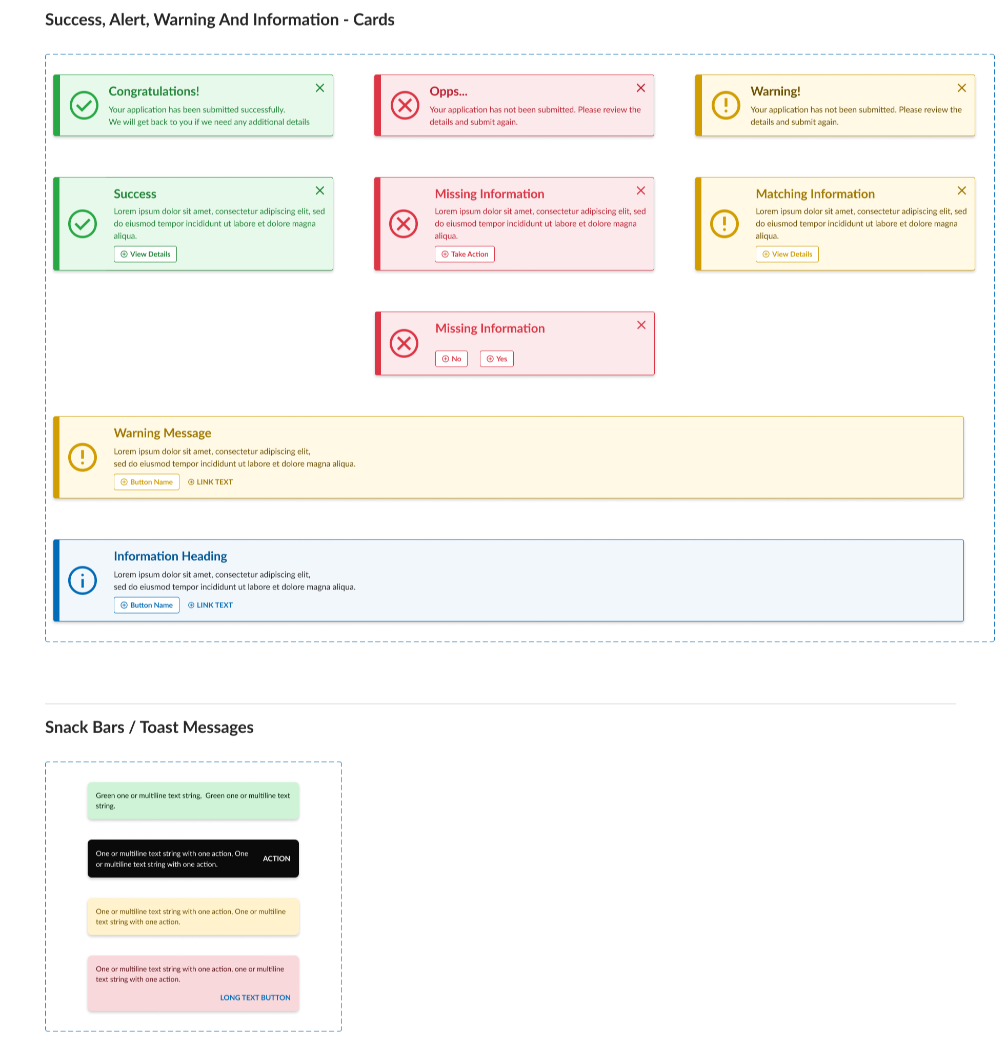
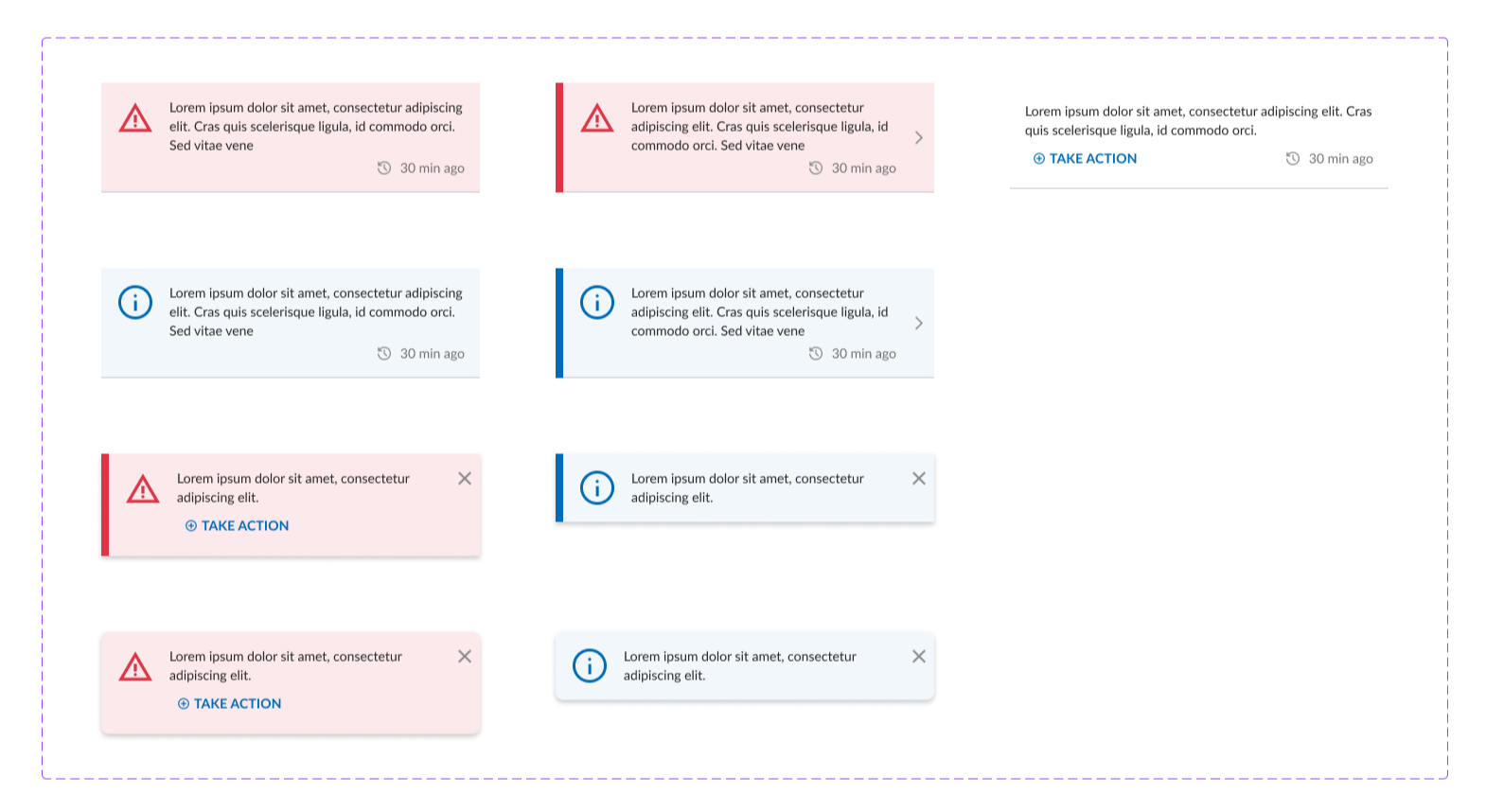
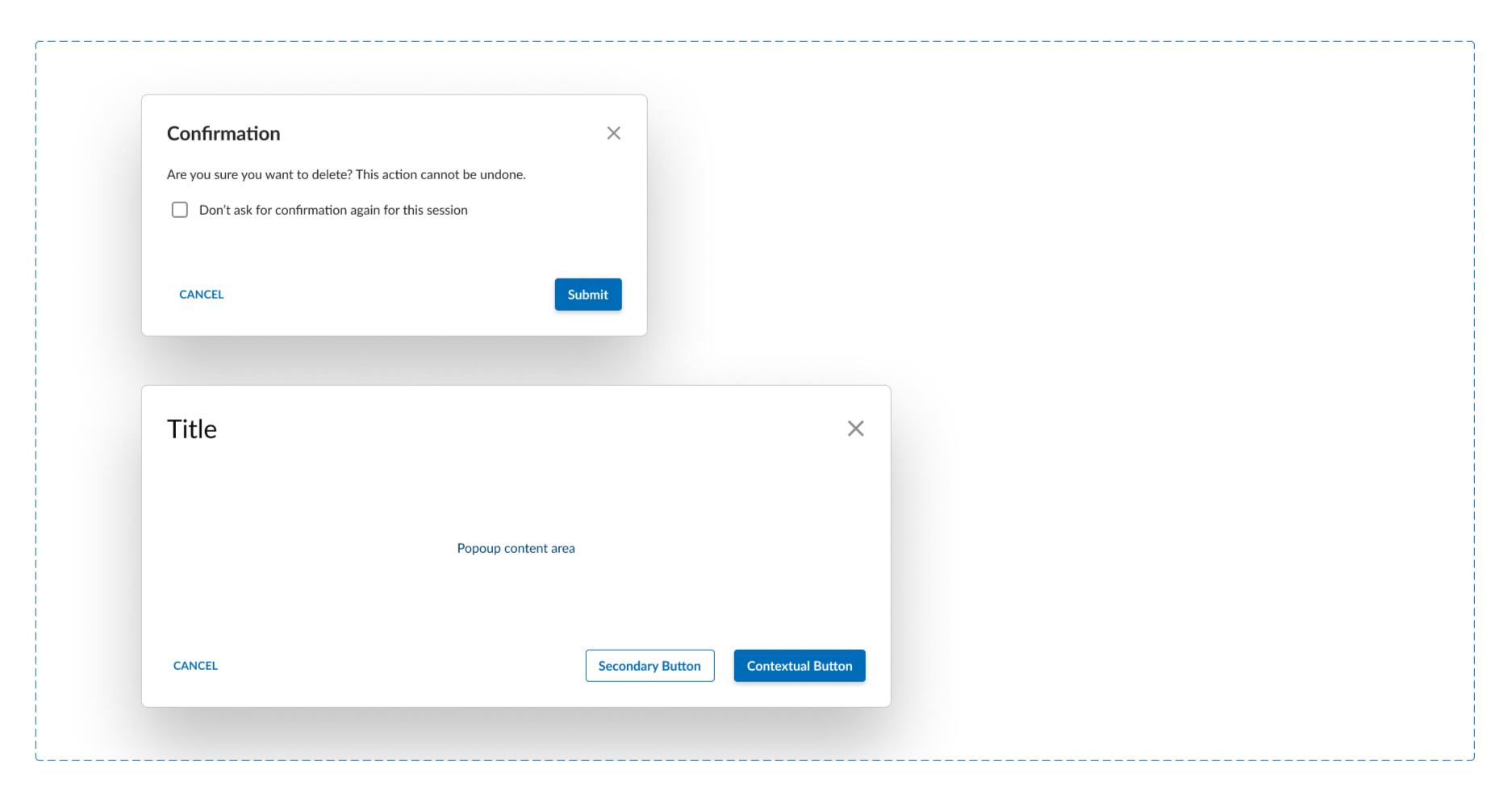
Feedback & Overlays
Messaging patterns were standardized to communicate status and critical actions consistently.
Evolution from Phase 1 to Phase 2
Phase 2 was not a complete redesign, but an evolution of the original system.
Improvements included:
Migration from XD to Figma
Rebuilding and standardizing the component library for scalability
Clearer hierarchy and organization
Better alignment with development workflows
Next Steps
A next step identified for the system was to implement development tokens and improve design–development alignment. This would enable more consistent implementation across products and support long-term governance as the system continues to evolve.
Final Note
This project represents my experience designing, maintaining, and evolving an enterprise healthcare design system over time, balancing scalability, clarity, and real-world constraints.